# 數據導入代碼
# 導入包
import matplotlib.pyplot as plt
import numpy as np
import pandas as pdplt.rcParams['font.sans-serif'] = ['SimHei']  #用來正常顯示中文標簽
plt.rcParams['axes.unicode_minus'] = False  #用來正常顯示負號ex1 = pd.read_csv('data/layout_ex1.csv')
ex1.head()
| Time | Temperature | |
|---|---|---|
| 0 | 1981-01 | 17.712903 |
| 1 | 1981-02 | 17.678571 |
| 2 | 1981-03 | 13.500000 |
| 3 | 1981-04 | 12.356667 |
| 4 | 1981-05 | 9.490323 |
# 配置正則表達式
t_raw = '(\d{4})-0?(\d{1,2})'
t_raw_data = ex1.Time.str.extract(t_raw)
ex1
| Time | Temperature | |
|---|---|---|
| 0 | 1981-01 | 17.712903 |
| 1 | 1981-02 | 17.678571 |
| 2 | 1981-03 | 13.500000 |
| 3 | 1981-04 | 12.356667 |
| 4 | 1981-05 | 9.490323 |
| ... | ... | ... |
| 115 | 1990-08 | 7.825806 |
| 116 | 1990-09 | 9.166667 |
| 117 | 1990-10 | 11.345161 |
| 118 | 1990-11 | 12.656667 |
| 119 | 1990-12 | 14.367742 |
120 rows × 2 columns
ex2 = ex1.copy()
ex2.insert(loc=0, column='Year', value=t_raw_data[0])
ex2.insert(loc=1, column='Month', value=t_raw_data[1])
ex2.tail()
| Year | Month | Time | Temperature | |
|---|---|---|---|---|
| 115 | 1990 | 8 | 1990-08 | 7.825806 |
| 116 | 1990 | 9 | 1990-09 | 9.166667 |
| 117 | 1990 | 10 | 1990-10 | 11.345161 |
| 118 | 1990 | 11 | 1990-11 | 12.656667 |
| 119 | 1990 | 12 | 1990-12 | 14.367742 |
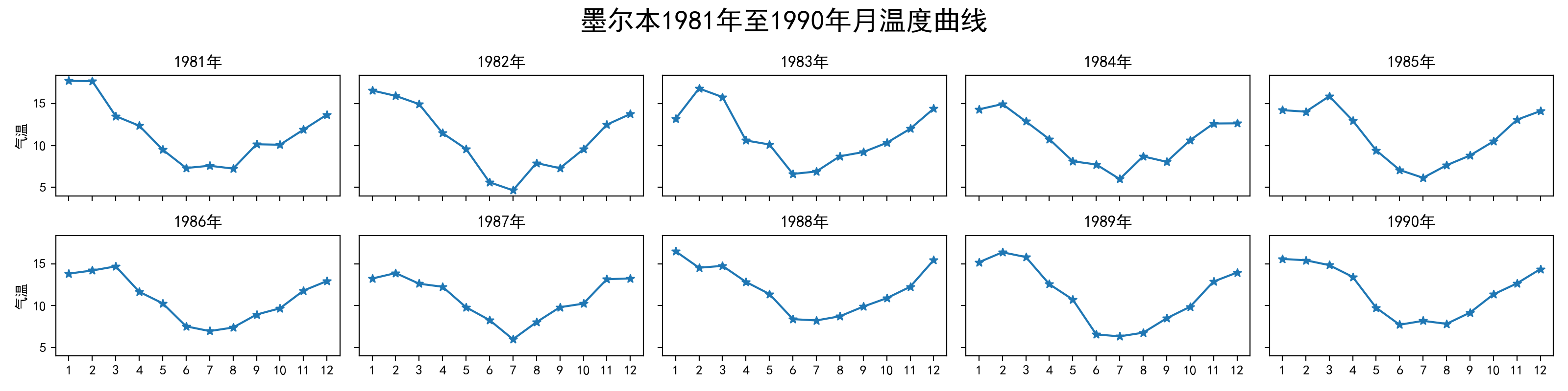
group = ex2.groupby(['Year'])
fig, axs = plt.subplots(2, 5, figsize=(20, 4), sharex=True, sharey=True)
fig.set_facecolor('#e6e6e6')
fig.suptitle('墨爾本1981年至1990年的每月溫度情況')
i = 0
for year, data in group:axs[i // 5][i % 5].plot(data.Month, data.Temperature,marker='*')axs[i // 5][i % 5].set_title(year+'年')#axs[i // 5][i % 5].set_xlim(1,12)if i % 5 == 0: axs[i // 5][i % 5].set_ylabel('氣溫')i += 1
np.random.randn(2, 150) 生成一組二維數據,使用兩種非均勻子圖的分割方法,做出該數據對應的散點圖和邊際分布圖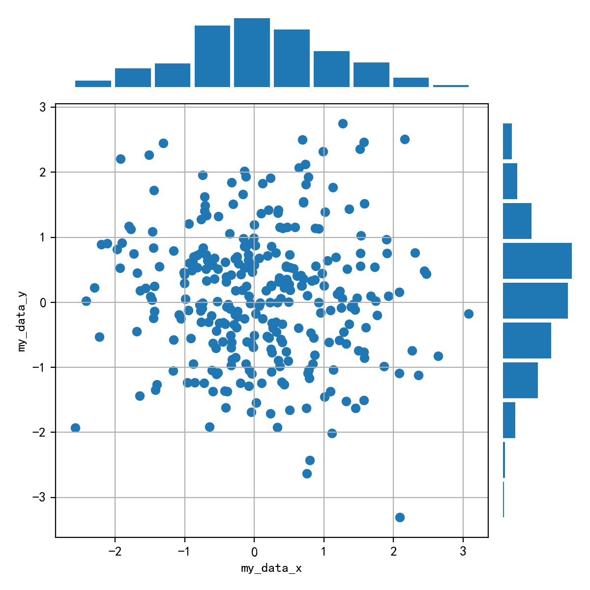
data = np.random.randn(2, 150)
data.shape
(2, 150)
fig = plt.figure(figsize=(10,10))
fig.subplots_adjust(left=None, bottom=None, right=None, top=None, wspace=0.03, hspace=0.03)
fig.set_facecolor('#e6e6e6')
spec = fig.add_gridspec(nrows=2,ncols=2,width_ratios=[3,1],height_ratios=[1,3])# sub1
ax = fig.add_subplot(spec[1,0])
ax.grid()
ax.scatter(data[0,:],data[1,:])
ax.set_xlabel('my_data_x',fontsize=14)
ax.set_ylabel('my_data_y',fontsize=14)# sub2
ax = fig.add_subplot(spec[0,0])
ax.hist(data[0,:],rwidth=0.9)
ax.axis('off')# sub3
ax = fig.add_subplot(spec[1,1])
ax.hist(data[1,:],orientation='horizontal',rwidth=0.9)
ax.axis('off')

版权声明:本站所有资料均为网友推荐收集整理而来,仅供学习和研究交流使用。

工作时间:8:00-18:00
客服电话
电子邮件
admin@qq.com
扫码二维码
获取最新动态


![[vijos1162]波浪数](https://images.cnblogs.com/OutliningIndicators/ContractedBlock.gif)