2019独角兽企业重金招聘Python工程师标准>>> 
With the introduction of Qt Style Sheets, styling Qt widgets has become a lot simpler. Whether you just need to customize the look of an existing widget or design a whole new style from scratch, there is now an alternative to subclassing QStyle.
- What are Qt Style Sheets?
- Basic Style Sheet Syntax
- The Box Model
- Foregrounds and Backgrounds
- Creating Scalable Styles
- Controlling the Size
- Handling Pseudo-States
- Micro Customization using Subcontrols
What are Qt Style Sheets?
Qt Style Sheets are heavily inspired by HTML Cascading Style Sheets (CSS) but adapted to widgets. You can set a style sheet on an individual child widget, on a whole window, or even on a whole application by calling QWidget::setStyleSheet() or QApplication::setStyleSheet().
Under the hood, style sheets are implemented by a special QStyle subclass called QStyleSheetStyle that acts as a wrapper for the platform-specific style. This special style applies any customizations specified using style sheets on top of the underlying platform-specific style.
Qt 4.2 includes a stylesheet example that lets you experiment with style sheets. It comes with two styles, Coffee and Pagefold.
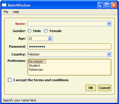
The Coffee style shown above customizes the look of push buttons, frames, labels, and tooltips, but lets the underlying style (e.g., Windows XP) draw checkboxes, comboboxes, and radio buttons.

In contrast, Pagefold fully redefines the look of all controls used in the dialog, resulting in a distinctive, platform-independent look.
This article is meant to be a quick introduction to style sheets. For a complete description of the Qt Style Sheet syntax, please refer to the online documentation or try out the stylesheet example, located in Qt 4.2's examples/widgets directory.
Basic Style Sheet Syntax
The Qt Style Sheet syntactic rules are almost the same as those of CSS. If you already know CSS, you can probably skip to the next section.
A style sheet consists of a sequence of style rules. Each rule has the form
selector { attribute: value }The "selector" part is typically a class name (e.g., QComboBox), but other syntaxes are possible. The "attribute" part is the name of a style sheet attribute, and "value" is the value that is assigned to the attribute.
For convenience, we can use the shorthand notation
selector1, selector2, ..., selectorM {attribute1: value1;attribute2: value2;...attributeN: valueN;
}
which simultaneously sets N attributes on any widget that matches any of the M selectors. For example,
QCheckBox, QComboBox, QSpinBox {color: red;background-color: white;font: bold;
}
sets the foreground and background colors and the fonts of all QCheckBoxes, QComboBoxes, and QSpinBoxes.
The online documentation lists the supported attributes for each widget type. In this article, we will concentrate on the most common attributes.
The Box Model
When using style sheets, every widget is treated as a box with four concentric rectangles: the margin rectangle, the border rectangle, the padding rectangle, and the content rectangle. For a plain widget &emdash; i.e., a widget with a 0-pixel margins, a 0-pixel thick border, and 0 pixels of padding &emdash; these four rectangles coincide exactly.

The margin area is outside the border and is always transparent. The border provides a frame for the widget. Several built-in frame styles, including inset,outset, solid, and ridge, are available by setting the border-style attribute. The padding provides spacing between the border and the content area.
Foregrounds and Backgrounds
The foreground color (the color used for drawing text) of the widget is specified using the color attribute. The background color, specified using background-color, fills the padding rectangle of the widget.
The background image, specified using background-image, is drawn in the rectangular area (margin, border, content or padding rectangle) specified by background-origin. The alignment and tiling of the background image within the rectangular area is modified using the background-position and background-repeat attribute respectively.
If we specify a background image with an alpha channel (for semi-transparency), the color specified using background-color will shine through. This can be used to reuse the same background image in a variety of contexts.

The following example illustrates the usage of the attributes seen so far:
QFrame {margin: 10px;border: 2px solid green;padding: 20px;background-color: gray;background-image: url(qt.png);background-position: top right;background-origin: content;background-repeat: none;
}
In this example, the specified margin, border, and padding apply uniformly to all four sides of all QFrames in the application. The margin attribute can be used to specify different top, right, bottom, and left values if we want:
QFrame {margin: 14px 18px 20px 18px;
}
Alternatively, we can use the margin-top, margin-right, margin-bottom, and margin-left attributes:
QFrame {margin-top: 14px;margin-right: 18px;margin-bottom: 20px;margin-left: 18px;
}
Although we have used QFrame in the examples above, we could have specified any Qt widget that supports the box model, including QCheckBox, QLabel,QLineEdit, QListView, QMenu, QPushButton, QTextEdit, and QToolTip.
Creating Scalable Styles
By default, background images specified using background-image are repeated as many times as necessary, both horizontally and vertically, to cover the widget's padding rectangle (i.e., the area inside the border). If we want to create backgrounds that scale nicely depending on the widget's size, we need to specify a so-called "border image".
Border images are specified using the border-image attribute. They provide both the border and the background of the widget. A border image is cut into nine cells, a bit like a tic-tac-toe board:

When filling the border of a widget, the four corner cells are taken more or less "as is", whereas the other five cells are either stretched or tiled to fill the available space.
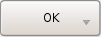
When specifying a border image, we must specify the four "cuts" that define the nine cells, in addition to the border image itself. We must also specify whether we want the non-corner cells to be stretched or tiled, and we must set border-width so that it corresponds to the cuts (to avoid scaling the corners).

For example, here's the style sheet necessary to produce the above push button (shown at four different sizes):
QPushButton {border-width: 4px;border-image: url(button.png) 4 4 4 4 stretch stretch;
}
As in the case of a background image, the border image may have an alpha channel that blends with the background-color.
Controlling the Size
The min-width and min-height attributes can be used to specify the minimum width and height of the contents area of a widget. These values affect theminimumSizeHint() of a widget, which will be honored by the layout. For example:
QPushButton {min-width: 68px;min-height: 28px;
}
If this attribute is not specified, the minimum height is derived from the widget's contents and the current style.
Handling Pseudo-States
The look of widgets can be customized for specific user interface states by specifying so-called pseudo-states in the style sheet. For example, we may prefer to give a push button a sunken look when it is pressed by the user by specifying the :pressed pseudo-state:
QPushButton {border: 2px outset green;background: gray;
}QPushButton:pressed {border-style: inset;
}
Here's the list of available pseudo-states:
| Pseudo-State | Description |
|---|---|
| :checked | The button widget is checked. |
| :disabled | The widget is disabled. |
| :enabled | The widget is enabled. |
| :focus | The widget has input focus. |
| :hover | The mouse is hovering over the widget. |
| :indeterminate | The checkbox or radiobutton is partially checked. |
| :off | For widgets that can be toggled, this applies to widgets in the "off" state. |
| :on | For widgets that can be toggled, this applies to widgets in the "on" state. This also applies to comboboxes that have their list open, and to menu bars that have one of their menus open. |
| :pressed | The widget is being pressed using the mouse. |
| :unchecked | The button widget is unchecked. |
Micro Customization using Subcontrols
Many widgets contain embedded elements, sometimes called "subcontrols". The up and down arrows of a spin box are typical examples of subcontrols.
Subcontrols can be specified using :: (e.g., QDateTimeEdit::up- button). Styling them is very similar to styling widgets. They follow the box model described above (i.e., they can have a border, a background, etc.) and can be combined with pseudo-states (e.g., QSpinBox::up-button:hover).
The table below lists the subcontrols that are available to style sheet authors:
| Subcontrol | Description |
|---|---|
| ::down-arrow | The down arrow of a combo or spin box. |
| ::down-button | The down button of a spin box. |
| ::drop-down | The drop-down arrow of a combobox. |
| ::indicator | The indicator of a checkbox, a radio button, or a checkable group box. |
| ::item | A menu, menu bar, or status bar item. |
| ::menu-indicator | The menu indicator of a push button. |
| ::title | The title of a group box. |
| ::up-arrow | The up arrow of a spin box. |
| ::up-button | The up button of a spin box. |
Subcontrols may be placed anywhere in the widget box using subcontrol-position and subcontrol-origin. The positioning of the subcontrol may be further fine tuned using absolute or relative positioning. The choice of positioning technique depends on whether the subcontrol has a fixed size or has a size that is dependent on the widget's box.
Relative Positioning
Relative positioning is suitable for subcontrols that have a fixed size (specified using the width and height attributes). Using this technique, the subcontrol may be moved by an offset from the position that was defined using subcontrol-position and subcontrol-origin. The left attribute may be used to move the subcontrol to the right and top attribute may be used to move the subcontrol to the bottom. For example:
QPushButton::menu-indicator {image: url(menu_indicator.png);width: 13px;height: 13px;subcontrol-origin: padding;subcontrol-position: bottom right;
}  | 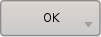 |
When the user presses a button, we can move the menu indicator from its original position by a few pixels to the bottom right to simulate a button press:
QPushButton::menu-indicator:pressed {position: relative;top: 2px;left: 2px;
}
Absolute Positioning
Absolute positioning is suitable for subcontrols with a size that depends on the size of the widget's box. As before, subcontrol-origin is used to define a rectangle of reference in the widget's box. The rectangular area for the subcontrol is then defined by providing offsets from the top, right, bottom, and left edges of this reference rectangle:
QPushButton::menu-indicator {border: 2px solid red;subcontrol-origin: padding;position: absolute;top: 2px;right: 2px;bottom: 2px;left: 40px;
}
For subcontrols that have a fixed width or a fixed height, the subcontrol-position maybe used to specify an alignment within the subcontrol-origin rectangle:
QPushButton::menu-indicator {image: url(menu_indicator.png);width: 13px;subcontrol-origin: padding;subcontrol-position: bottom right;position: relative;top: 2px;bottom: 2px;right: 2px;
}