今天继续 跟着Nature Communications学画图系列第二篇。学习R语言基础绘图函数画散点图。
对应的 Nature Communications 的论文是 Fecal pollution can explain antibiotic resistance gene abundances in anthropogenically impacted environments
这篇论文数据分析和可视化的部分用到的数据和代码全部放到了github上 https://github.com/karkman/crassphage_project
散点图命令,非常好的R语言学习素材。
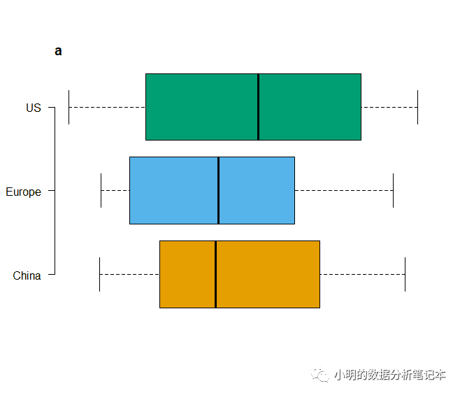
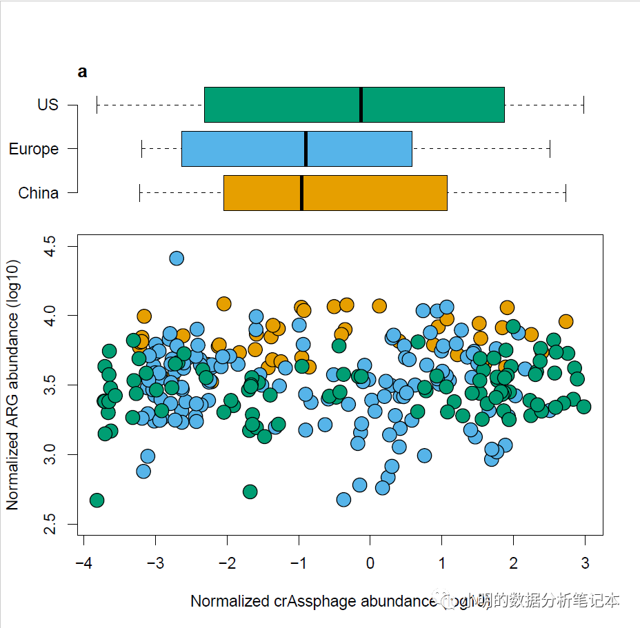
今天学习Figure1中被红色框线圈住的散点图

跟着Nature Communications学画图~Figure1~基础绘图函数箱线图
这篇文章中有人留言说 和原图不是很像,因为配色没有按照论文中提供的代码来。 下面是完全重复论文中的代码
cols boxplot(log10(rel_crAss)~country,data=HMP,col=cols,
        axes=F,xlab=NULL,ylab=NULL,
        horizontal = T)
axis(2,at=c(1,2,3),labels=c("China", "Europe", "US"),las=1)
title("a",adj=0,line=0)
HMPplot(rel_res~rel_crAss,data=HMP)
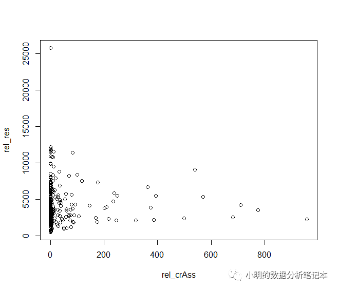
matplotlib画图?画图用plot()函数,需要指定画图用到的变量y和x,还有画图用到的数据data
原始代码分别对 rel_res 和 rel_crAss取了log10
plot(log10(rel_res)~log10(rel_crAss),data=HMP)
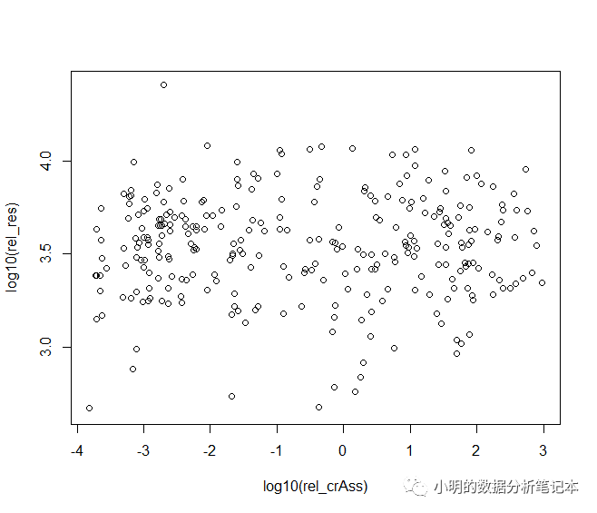
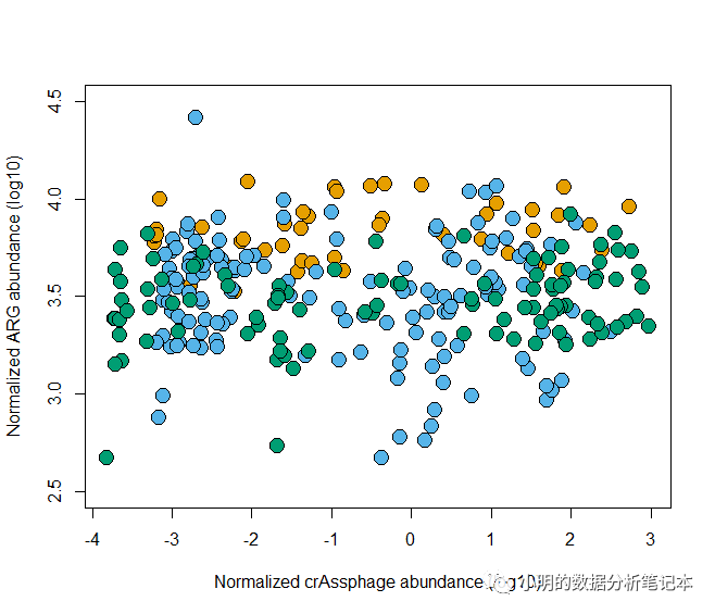
取log10以后可以看到散点分布的更加均匀了。
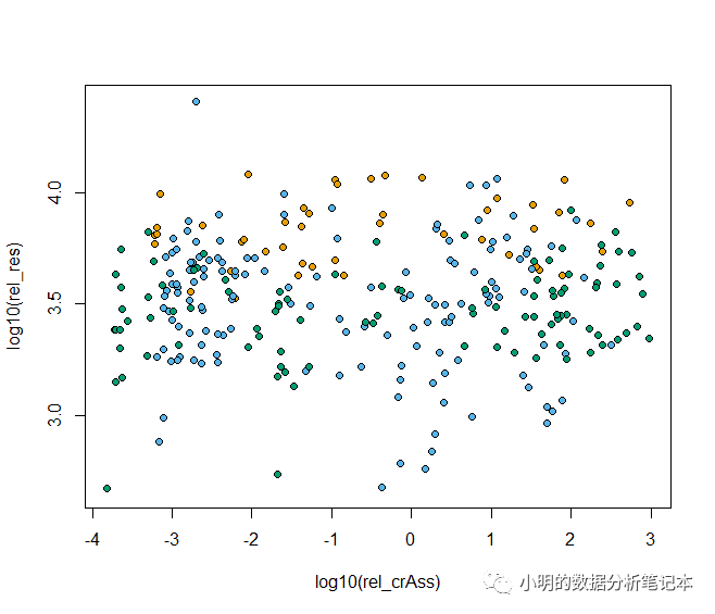
cols plot(log10(rel_res)~log10(rel_crAss), data=HMP,
     bg=cols[as.factor(HMP$country)],pch=21)
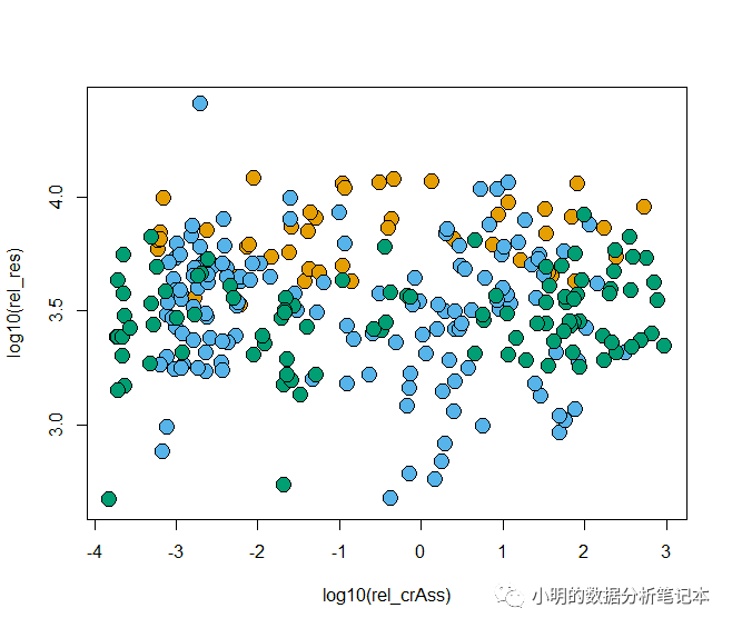
plot(log10(rel_res)~log10(rel_crAss), data=HMP,
     bg=cols[as.factor(HMP$country)],pch=21,cex=2)
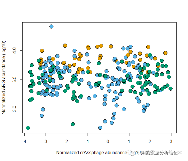
plot(log10(rel_res)~log10(rel_crAss), data=HMP, bg=cols[as.factor(HMP$country)], pch=21,
     ylab = "Normalized ARG abundance (log10)",
     xlab="Normalized crAssphage abundance (log10)", cex=2)
plot(log10(rel_res)~log10(rel_crAss), data=HMP,
     bg=cols[as.factor(HMP$country)], pch=21,
     ylab = "Normalized ARG abundance (log10)",
     xlab="Normalized crAssphage abundance (log10)",
     cex=2,
     ylim=c(2.5, 4.5))
接下来将箱线图和散点图按照上下拼接到一起,用到的是par(fig=c(a,b,c,d)),这里需要满足 a
r语言绘制散点图?具体可以参考链接 https://blog.csdn.net/qingchongxinshuru/article/details/52004182
par(fig=c(0,1,0,0.75))
plot(log10(rel_res)~log10(rel_crAss), data=HMP,
     bg=cols[as.factor(HMP$country)], pch=21,
     ylab = "Normalized ARG abundance (log10)",
     xlab="Normalized crAssphage abundance (log10)",
     cex=2,
     ylim=c(2.5, 4.5))
par(fig=c(0,1,0.5,1),new=T)
boxplot(log10(rel_crAss)~country,data=HMP,col=cols,
        axes=F,xlab=NULL,ylab=NULL,
        horizontal = T)
axis(2,at=c(1,2,3),labels=c("China", "Europe", "US"),las=1)
title("a",adj=0,line=0)
欢迎大家关注我的公众号
小明的数据分析笔记本
版权声明:本站所有资料均为网友推荐收集整理而来,仅供学习和研究交流使用。

工作时间:8:00-18:00
客服电话
电子邮件
admin@qq.com
扫码二维码
获取最新动态