喜歡記得點個贊喲,我是王睿,很高興認識大家!
鴻蒙OS系統,簡單:文本框組件
官方:Text是用來顯示字符串的組件,在界面上顯示為一塊文本區域。

MainAbilitySlice.java
Text text = (Text) findComponentById(ResourceTable.Id_text);
// 設置自動調整規則
text.setAutoFontSizeRule(30, 100, 1);
// 設置點擊一次增多一個"T"
text.setClickedListener(new Component.ClickedListener() {@Overridepublic void onClick(Component component) {text.setText(text.getText() + "T");}
});
ability_main.xml
<DependentLayoutxmlns:ohos="http://schemas.huawei.com/res/ohos"ohos:width="match_parent"ohos:height="match_content"><Textohos:id="$+id:text"ohos:width="match_parent"ohos:height="match_content"ohos:text="TextTextTextTextTextTextTextTextTextTextTextTextTextTextTextTextTextText"ohos:text_size="50fp"ohos:text_color="#0000FF"ohos:italic="true"ohos:text_alignment="vertical_center"ohos:text_weight="700"ohos:text_font="serif"ohos:background_element="$graphic:background_text"/>
</DependentLayout>

HARMONYOS?MainAbilitySlice.java
        Text text = (Text) findComponentById(ResourceTable.Id_text);
// 跑馬燈效果text.setTruncationMode(Text.TruncationMode.AUTO_SCROLLING);
// 始終處于自動滾動狀態text.setAutoScrollingCount(Text.AUTO_SCROLLING_FOREVER);
// 啟動跑馬燈效果text.startAutoScrolling();
ability_main.xml
<?xml version="1.0" encoding="utf-8"?>
<DependentLayoHutxmlns:ohos="http://schemas.huawei.com/res/ohos"ohos:width="match_parent"ohos:height="match_content"ohos:background_element="$graphic:color_light_gray_element"><Textohos:id="$+id:text"ohos:width="75vp"ohos:height="match_content"ohos:text="TextText"ohos:text_size="28fp"ohos:text_color="#0000FF"ohos:italic="true"ohos:text_alignment="vertical_center"ohos:text_weight="700"ohos:text_font="serif"ohos:background_element="$graphic:background_text"/>
</DependentLayoHut>
ability_main.xml
<?xml version="1.0" encoding="utf-8"?>
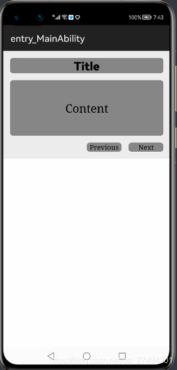
<DependentLayoutxmlns:ohos="http://schemas.huawei.com/res/ohos"ohos:width="match_parent"ohos:height="match_content"ohos:background_element="$graphic:color_light_gray_element"><Textohos:id="$+id:text1"ohos:width="match_parent"ohos:height="match_content"ohos:text_size="25fp"ohos:top_margin="15vp"ohos:left_margin="15vp"ohos:right_margin="15vp"ohos:background_element="$graphic:background_text"ohos:text="Title"ohos:text_weight="1000"ohos:text_alignment="horizontal_center"/><Textohos:id="$+id:text2"ohos:width="match_parent"ohos:height="120vp"ohos:text_size="25fp"ohos:background_element="$graphic:background_text"ohos:text="Content"ohos:top_margin="15vp"ohos:left_margin="15vp"ohos:right_margin="15vp"ohos:bottom_margin="15vp"ohos:text_alignment="center"ohos:below="$id:text1"ohos:text_font="serif"/><Buttonohos:id="$+id:button1"ohos:width="75vp"ohos:height="match_content"ohos:text_size="15fp"ohos:background_element="$graphic:background_text"ohos:text="Previous"ohos:right_margin="15vp"ohos:bottom_margin="15vp"ohos:left_padding="5vp"ohos:right_padding="5vp"ohos:below="$id:text2"ohos:left_of="$id:button2"ohos:text_font="serif"/><Buttonohos:id="$+id:button2"ohos:width="75vp"ohos:height="match_content"ohos:text_size="15fp"ohos:background_element="$graphic:background_text"ohos:text="Next"ohos:right_margin="15vp"ohos:bottom_margin="15vp"ohos:left_padding="5vp"ohos:right_padding="5vp"ohos:align_parent_end="true"ohos:below="$id:text2"ohos:text_font="serif"/>
</DependentLayout>
HarmonyOS下載?下面這兩個是自定義樣式文件,需要放在 resources/base/graphic目錄下,新建background_text.xml 與 color_light_gray_element.xml文件
background_text.xml:
<?xml version="1.0" encoding="utf-8"?>
<shape xmlns:ohos="http://schemas.huawei.com/res/ohos"ohos:shape="rectangle"><cornersohos:radius="20"/><solidohos:color="#878787"/>
</shape>
color_light_gray_element.xml:
<?xml version="1.0" encoding="utf-8"?>
<shape xmlns:ohos="http://schemas.huawei.com/res/ohos"ohos:shape="rectangle"><solidohos:color="#EDEDED"/>
</shape>
Text更多詳情
HarmonyOS系統主題?簡單:按鈕組件
官方:Button是一種常見的組件,點擊可以觸發對應的操作,通常由文本或圖標組成,也可以由圖標和文本共同組成。
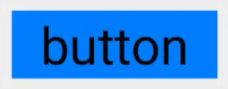
<Buttonohos:width="150vp"ohos:height="50vp"ohos:text_size="27fp"ohos:text="button"ohos:background_element="$graphic:color_blue_element"ohos:left_margin="15vp"ohos:bottom_margin="15vp"ohos:right_padding="8vp"ohos:left_padding="8vp"
/>
color_blue_element.xml
<?xml version="1.0" encoding="utf-8"?>
<shape xmlns:ohos="http://schemas.huawei.com/res/ohos"ohos:shape="rectangle"><solidohos:color="#007CFD"/>
</shape>
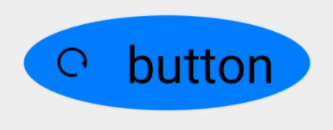
<Buttonohos:width="150vp"ohos:height="50vp"ohos:text_size="27fp"ohos:text="button"ohos:background_element="$graphic:oval_button_element"ohos:left_margin="15vp"ohos:bottom_margin="15vp"ohos:right_padding="8vp"ohos:left_padding="8vp"ohos:element_left="$media:ic_btn_reload"
/>
oval_button_element.xml:
<?xml version="1.0" encoding="utf-8"?>
<shape xmlns:ohos="http://schemas.huawei.com/res/ohos"ohos:shape="oval"><solidohos:color="#007CFD"/>
</shape>
<?xml version="1.0" encoding="utf-8"?>
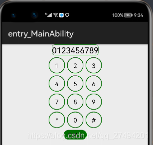
<DirectionalLayoutxmlns:ohos="http://schemas.huawei.com/res/ohos"ohos:width="match_parent"ohos:height="match_parent"ohos:background_element="$graphic:color_light_gray_element"ohos:orientation="vertical"><Textohos:width="match_content"ohos:height="match_content"ohos:text_size="20fp"ohos:text="0123456789"ohos:background_element="$graphic:green_text_element"ohos:text_alignment="center"ohos:layout_alignment="horizontal_center"/><DirectionalLayoutohos:width="match_parent"ohos:height="match_content"ohos:alignment="horizontal_center"ohos:orientation="horizontal"ohos:top_margin="5vp"ohos:bottom_margin="5vp"><Buttonohos:width="40vp"ohos:height="40vp"ohos:text_size="15fp"ohos:background_element="$graphic:green_circle_button_element"ohos:text="1"ohos:text_alignment="center"/><Buttonohos:width="40vp"ohos:height="40vp"ohos:text_size="15fp"ohos:background_element="$graphic:green_circle_button_element"ohos:text="2"ohos:left_margin="5vp"ohos:right_margin="5vp"ohos:text_alignment="center"/><Buttonohos:width="40vp"ohos:height="40vp"ohos:text_size="15fp"ohos:background_element="$graphic:green_circle_button_element"ohos:text="3"ohos:text_alignment="center"/></DirectionalLayout><DirectionalLayoutohos:width="match_parent"ohos:height="match_content"ohos:alignment="horizontal_center"ohos:orientation="horizontal"ohos:bottom_margin="5vp"><Buttonohos:width="40vp"ohos:height="40vp"ohos:text_size="15fp"ohos:background_element="$graphic:green_circle_button_element"ohos:text="4"ohos:text_alignment="center"/><Buttonohos:width="40vp"ohos:height="40vp"ohos:text_size="15fp"ohos:left_margin="5vp"ohos:right_margin="5vp"ohos:background_element="$graphic:green_circle_button_element"ohos:text="5"ohos:text_alignment="center"/><Buttonohos:width="40vp"ohos:height="40vp"ohos:text_size="15fp"ohos:background_element="$graphic:green_circle_button_element"ohos:text="6"ohos:text_alignment="center"/></DirectionalLayout><DirectionalLayoutohos:width="match_parent"ohos:height="match_content"ohos:alignment="horizontal_center"ohos:orientation="horizontal"ohos:bottom_margin="5vp"><Buttonohos:width="40vp"ohos:height="40vp"ohos:text_size="15fp"ohos:background_element="$graphic:green_circle_button_element"ohos:text="7"ohos:text_alignment="center"/><Buttonohos:width="40vp"ohos:height="40vp"ohos:text_size="15fp"ohos:left_margin="5vp"ohos:right_margin="5vp"ohos:background_element="$graphic:green_circle_button_element"ohos:text="8"ohos:text_alignment="center"/><Buttonohos:width="40vp"ohos:height="40vp"ohos:text_size="15fp"ohos:background_element="$graphic:green_circle_button_element"ohos:text="9"ohos:text_alignment="center"/></DirectionalLayout><DirectionalLayoutohos:width="match_parent"ohos:height="match_content"ohos:alignment="horizontal_center"ohos:orientation="horizontal"ohos:bottom_margin="5vp"><Buttonohos:width="40vp"ohos:height="40vp"ohos:text_size="15fp"ohos:background_element="$graphic:green_circle_button_element"ohos:text="*"ohos:text_alignment="center"/><Buttonohos:width="40vp"ohos:height="40vp"ohos:text_size="15fp"ohos:left_margin="5vp"ohos:right_margin="5vp"ohos:background_element="$graphic:green_circle_button_element"ohos:text="0"ohos:text_alignment="center"/><Buttonohos:width="40vp"ohos:height="40vp"ohos:text_size="15fp"ohos:background_element="$graphic:green_circle_button_element"ohos:text="#"ohos:text_alignment="center"/></DirectionalLayout><Buttonohos:width="match_content"ohos:height="match_content"ohos:text_size="15fp"ohos:text="CALL"ohos:background_element="$graphic:green_capsule_button_element"ohos:bottom_margin="5vp"ohos:text_alignment="center"ohos:layout_alignment="horizontal_center"ohos:left_padding="10vp"ohos:right_padding="10vp"ohos:top_padding="2vp"ohos:bottom_padding="2vp"/>
</DirectionalLayout>
color_light_gray_element.xml:
<?xml version="1.0" encoding="utf-8"?>
<shape xmlns:ohos="http://schemas.huawei.com/res/ohos"ohos:shape="rectangle"><solidohos:color="#EDEDED"/>
</shape>
<?xml version="1.0" encoding="utf-8"?>
<shape xmlns:ohos="http://schemas.huawei.com/res/ohos"ohos:shape="rectangle"><cornersohos:radius="20"/><strokeohos:width="2"ohos:color="#006E00"/><solidohos:color="#EDEDED"/>
</shape>
<?xml version="1.0" encoding="utf-8"?>
<shape xmlns:ohos="http://schemas.huawei.com/res/ohos"ohos:shape="oval"><strokeohos:width="5"ohos:color="#006E00"/><solidohos:color="#EDEDED"/>
</shape>
<?xml version="1.0" encoding="utf-8"?>
<shape xmlns:ohos="http://schemas.huawei.com/res/ohos"ohos:shape="rectangle"><cornersohos:radius="100"/><solidohos:color="#006E00"/>
</shape>
Button 更多詳情
簡單:文本輸入框組件。
官方:TextField 提供了一種文本輸入框組件。
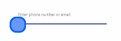
ability_main.xml
<?xml version="1.0" encoding="utf-8"?>
<DirectionalLayoutxmlns:ohos="http://schemas.huawei.com/res/ohos"ohos:width="match_parent"ohos:height="match_parent"ohos:orientation="vertical"><TextFieldohos:id="$+id:text_field"ohos:height="40vp"ohos:width="200vp"ohos:background_element="$graphic:background_text_field"ohos:left_padding="20vp"ohos:hint="Enter phone number or email"ohos:layout_alignment="horizontal_center"ohos:top_margin="60fp"ohos:element_cursor_bubble="$graphic:ele_cursor_bubble"ohos:basement="#000099"ohos:text_alignment="vertical_center"/>
</DirectionalLayout>
background_text_field.xml
<?xml version="1.0" encoding="UTF-8" ?>
<shape xmlns:ohos="http://schemas.huawei.com/res/ohos"ohos:shape="rectangle"><cornersohos:radius="40"/><solidohos:color="#FFFFFF"/>
</shape>
ele_cursor_bubble.xml
<?xml version="1.0" encoding="UTF-8" ?>
<shape xmlns:ohos="http://schemas.huawei.com/res/ohos"ohos:shape="rectangle"><cornersohos:radius="40"/><solidohos:color="#6699FF"/><strokeohos:color="#0066FF"ohos:width="10"/>
</shape>

MainAbilitySlice.java
// 當點擊登錄,改變相應組件的樣式Button button = (Button) findComponentById(ResourceTable.Id_ensure_button);button.setClickedListener((component -> {Text text = (Text) findComponentById(ResourceTable.Id_error_tip_text);// 顯示錯誤提示的Texttext.setVisibility(Component.VISIBLE);TextField textField = (TextField) findComponentById(ResourceTable.Id_name_textField);// 顯示TextField錯誤狀態下的樣式ShapeElement errorElement = new ShapeElement(this, ResourceTable.Graphic_background_text_field_error);textField.setBackground(errorElement);// TextField失去焦點textField.clearFocus();}));ability_main.xml
<?xml version="1.0" encoding="utf-8"?>
<DirectionalLayoutxmlns:ohos="http://schemas.huawei.com/res/ohos"ohos:width="match_parent"ohos:height="match_parent"ohos:background_element="#FF000000"ohos:orientation="vertical"><StackLayoutohos:top_margin="60vp"ohos:width="match_parent"ohos:height="match_content"ohos:layout_alignment="center"><TextFieldohos:id="$+id:name_textField"ohos:width="match_parent"ohos:height="match_content"ohos:multiple_lines="false"ohos:left_padding="24vp"ohos:right_padding="24vp"ohos:top_padding="8vp"ohos:bottom_padding="8vp"ohos:min_height="44vp"ohos:text_size="18fp"ohos:layout_alignment="center"ohos:text_alignment="vertical_center"ohos:background_element="$graphic:background_text_field"ohos:hint="Enter phone number or email" /><Textohos:visibility="hide"ohos:id="$+id:error_tip_text"ohos:width="match_content"ohos:height="match_content"ohos:top_padding="8vp"ohos:bottom_padding="8vp"ohos:right_margin="20vp"ohos:text="Incorrect account or password"ohos:text_size="18fp"ohos:text_color="red"ohos:layout_alignment="right"/></StackLayout><TextFieldohos:top_margin="40vp"ohos:id="$+id:password_text_field"ohos:width="match_parent"ohos:height="match_content"ohos:multiple_lines="false"ohos:left_padding="24vp"ohos:right_padding="24vp"ohos:top_padding="8vp"ohos:bottom_padding="8vp"ohos:min_height="44vp"ohos:text_size="18fp"ohos:layout_alignment="center"ohos:text_alignment="vertical_center"ohos:background_element="$graphic:background_text_field"ohos:hint="Enter password" /><Buttonohos:top_margin="40vp"ohos:id="$+id:ensure_button"ohos:width="120vp"ohos:height="35vp"ohos:background_element="$graphic:background_btn"ohos:text="Log in"ohos:text_size="20fp"ohos:layout_alignment="horizontal_center"/></DirectionalLayout>
background_text_field.xml
<?xml version="1.0" encoding="UTF-8" ?>
<shape xmlns:ohos="http://schemas.huawei.com/res/ohos"ohos:shape="rectangle"><cornersohos:radius="40"/><solidohos:color="white"/><strokeohos:color="black"ohos:width="6"/>
</shape>
background_btn.xml
<?xml version="1.0" encoding="UTF-8" ?>
<shape xmlns:ohos="http://schemas.huawei.com/res/ohos"ohos:shape="rectangle"><cornersohos:radius="35"/><solidohos:color="white"/>
</shape>
xml屬性
background_element		背景樣式
hint					提示文字
element_cursor_bubble	氣泡
multiple_lines			多行顯示
basement				設置基線(底邊線)
java
TextField textField = (TextField) findComponentById(ResourceTable.Id_text_field);//獲取輸入框的內容
String content = textField.getText();//設置TextField不可用狀態
textField.setEnabled(false);//響應焦點變化
textField.setFocusChangedListener((component, isFocused) -> {if (isFocused) { // 獲取到焦點...} else { // 失去焦點...}
});
TextField 更多詳情
Image是用來顯示圖片的組件
(1)準備工作 將圖片放入 resources/media/

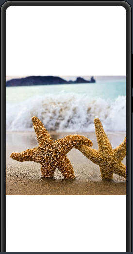
(2)方式一:在XML中創建Image
<Imageohos:id="$+id:image"ohos:width="match_content"ohos:height="match_content"ohos:layout_alignment="center"ohos:image_src="$media:haixing"/>
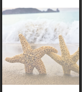
(3)方式二:在Java代碼中創建Image
//創建Image 對象
Image image = new Image(getContext());
//設置圖片(參數:資源路徑)
image.setPixelMap(ResourceTable.Media_plant);
(1)設置透明度效果
ohos:image_src="$media:plant"
(2)設置縮放系數
ohos:scale_x="0.5"ohos:scale_y="0.5"
(3)設置縮放方式
ohos:scale_mode="zoom_center"
(4)設置剪切對齊方式
ohos:clip_alignment="left"
Image更多詳情
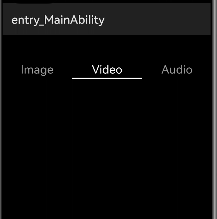
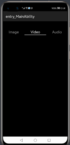
簡單:頁簽欄組件
官方:Tablist可以實現多個頁簽欄的切換,Tab為某個頁簽。子頁簽通常放在內容區上方,展示不同的分類。頁簽名稱應該簡潔明了,清晰描述分類的內容。
(1)設置默認狀態和選中狀態的字體顏色和indicator的顏色
<TabList...ohos:normal_text_color="#999999"ohos:selected_text_color="#FFFFFF"ohos:selected_tab_indicator_color="#FFFFFF"ohos:selected_tab_indicator_height="2vp"/>
(2)設置Tab的布局
tabList.setTabLength(140 * 3); // 設置Tab的寬度
tabList.setTabMargin(24 * 3); // 設置兩個Tab之間的間距
(3)設置固定模式
默認為false,該模式下TabList的總寬度是各Tab寬度的總和,若固定了TabList的寬度,當超出可視區域,則可以通過滑動TabList來顯示。如果設置為true,TabList的總寬度將與可視區域相同,各個Tab的寬度也會根據TabList的寬度而平均分配,該模式適用于Tab較少的情況。
tabList.setFixedMode(true);
tabList.setFixedMode(false);

(4)在某個位置新增Tab
TabList.Tab tab = tabList.new Tab(getContext());
tab.setText("News");
tab.setMinWidth(64);
tab.setPadding(12, 0, 12, 0);
tabList.addTab(tab, 1); // 1表示位置
(5)響應焦點變化
tabList.addTabSelectedListener(new TabList.TabSelectedListener() {@Overridepublic void onSelected(TabList.Tab tab) {// 當某個Tab從未選中狀態變為選中狀態時的回調...}@Overridepublic void onUnselected(TabList.Tab tab) {// 當某個Tab從選中狀態變為未選中狀態時的回調...}@Overridepublic void onReselected(TabList.Tab tab) {// 當某個Tab已處于選中狀態,再次被點擊時的狀態回調...}
});
(1)設置Tab屬性
tab.setMinWidth(64);
tab.setPadding(12, 0, 12, 0);
(2)選中某個Tab
tab.select();
(3)獲取Tab在TabList中的位置索引
tab.getPosition();
MainAbilitySlice.java
TabList tabList = (TabList) findComponentById(ResourceTable.Id_tab_list);tabList.setTabLength(140*3); // 設置Tab的寬度tabList.setTabMargin(24*3); // 設置兩個Tab之間的間距//添加標簽TabList.Tab tab1 = tabList.new Tab(getContext());tab1.setText("Image");tabList.addTab(tab1);TabList.Tab tab2 = tabList.new Tab(getContext());tab2.setText("Video");tabList.addTab(tab2);TabList.Tab tab3= tabList.new Tab(getContext());tab3.setText("Audio");tabList.addTab(tab3);tabList.setFixedMode(true); //設置固定模式
ability_main.xml
<?xml version="1.0" encoding="utf-8"?>
<DirectionalLayoutxmlns:ohos="http://schemas.huawei.com/res/ohos"ohos:height="match_parent"ohos:width="match_parent"ohos:background_element="black"ohos:orientation="vertical"><TabListohos:id="$+id:tab_list"ohos:top_margin="40vp"ohos:tab_margin="24vp"ohos:tab_length="140vp"ohos:text_size="20fp"ohos:height="36vp"ohos:width="match_parent"ohos:layout_alignment="center"ohos:orientation="horizontal"ohos:text_alignment="center"ohos:normal_text_color="#999999"ohos:selected_text_color="#FFFFFF"ohos:selected_tab_indicator_color="#FFFFFF"ohos:selected_tab_indicator_height="2vp"/></DirectionalLayout>
TabList和Tab 更多詳情
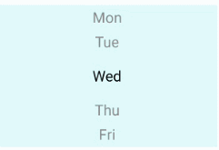
Picker提供了滑動選擇器,允許用戶從預定義范圍中進行選擇。

<Pickerohos:id="$+id:test_picker"ohos:height="match_content"ohos:width="300vp"ohos:background_element="#E1FFFF"ohos:layout_alignment="horizontal_center"ohos:normal_text_size="16fp"ohos:selected_text_size="16fp"/>
Picker picker = (Picker) findComponentById(ResourceTable.Id_test_picker);
picker.setMinValue(0); // 設置選擇器中的最小值
picker.setMaxValue(6); // 設置選擇器中的最大值
picker.setValueChangedListener((picker1, oldVal, newVal) -> {// oldVal:上一次選擇的值; newVal:最新選擇的值
});

picker.setFormatter(i -> {String value;switch (i) {case 0:value = "Mon";break;case 1:value = "Tue";break;case 2:value = "Wed";break;case 3:value = "Thu";break;case 4:value = "Fri";break;case 5:value = "Sat";break;case 6:value = "Sun";break;default:value = "" + i;}return value;
});
picker.setDisplayedData(new String[]{"Mon", "Tue", "Wed", "Thu", "Fri", "Sat", "Sun"});
(1)設置文本樣式

<?xml version="1.0" encoding="utf-8"?>
<DirectionalLayoutxmlns:ohos="http://schemas.huawei.com/res/ohos"ohos:height="match_parent"ohos:width="match_parent"ohos:background_element="black"ohos:orientation="vertical"><Pickerohos:id="$+id:test_picker"ohos:height="match_content"ohos:width="300vp"ohos:background_element="#E1FFFF"ohos:layout_alignment="horizontal_center"ohos:normal_text_size="16fp"ohos:normal_text_color="#FFA500"ohos:selected_text_size="16fp"ohos:selected_text_color="#00FFFF"/></DirectionalLayout>
 Picker picker = (Picker) findComponentById(ResourceTable.Id_test_picker);picker.setDisplayedData(new String[]{"Mon", "Tue", "Wed", "Thu", "Fri", "Sat", "Sun"});//設置文本樣式
picker.setNormalTextFont(Font.DEFAULT_BOLD);
picker.setNormalTextSize(40);
picker.setNormalTextColor(new Color(Color.getIntColor("#FFA500")));
picker.setSelectedTextFont(Font.DEFAULT_BOLD);
picker.setSelectedTextSize(40);
picker.setSelectedTextColor(new Color(Color.getIntColor("#00FFFF")));
(2) 設置所選文本的上下邊框

<Picker...ohos:bottom_line_element="#40E0D0"ohos:top_line_element="#40E0D0"/>
//創建 shape 對象
ShapeElement shape = new ShapeElement();
//設置矩形
shape.setShape(ShapeElement.RECTANGLE);
//設置顏色
shape.setRgbColor(RgbColor.fromArgbInt(0xFF40E0D0));
// 單獨設置上邊框
// picker.setDisplayedLinesTopElement(shape);
// 單獨設置下邊框
// picker.setDisplayedLinesBottomElement(shape);
// 同時設置上下邊框
picker.setDisplayedLinesElements(shape, shape);
(3)設置Picker的著色器顏色

<Picker...ohos:shader_color="#1E90FF"/>
picker.setShaderColor(new Color(Color.getIntColor("#1E90FF")));
(4)設置Picker中所選文本邊距與普通文本邊距的比例
<Picker...ohos:selected_normal_text_margin_ratio="5.0">
</Picker>
picker.setSelectedNormalTextMarginRatio(5.0f);
(5)設置選擇輪模式
該模式是來決定Picker是否是循環顯示數據的。

<Picker...ohos:wheel_mode_enabled="true"/>
picker.setWheelModeEnabled(true);
Picker 更多詳情
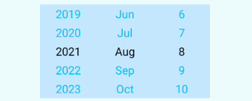
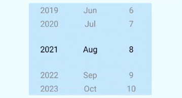
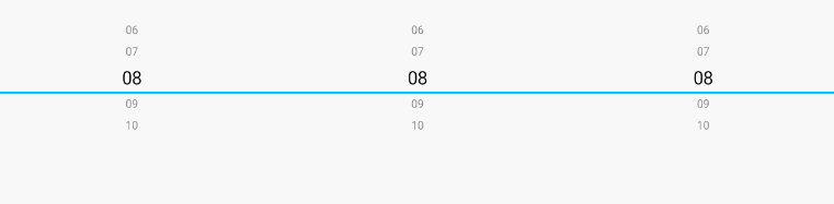
日期選擇器

<DatePickerohos:id="$+id:date_pick"ohos:height="match_content"ohos:width="match_parent"ohos:text_size="20vp"ohos:background_element="#FF98C6F1"></DatePicker>
(1)響應日期改變事件:

<Textohos:id="$+id:text_date"ohos:height="match_content"ohos:width="match_parent"ohos:hint="date"ohos:margin="8vp"ohos:padding="4vp"ohos:text_size="14fp">
</Text>
DatePicker datePicker = (DatePicker) findComponentById(ResourceTable.Id_date_pick);
Text selectedDate = (Text) findComponentById(ResourceTable.Id_text_date);
datePicker.setValueChangedListener(new DatePicker.ValueChangedListener() {@Override		//參數依次為:實例、年、月、日public void onValueChanged(DatePicker datePicker, int year, int monthOfYear, int dayOfMonth) {selectedDate.setText(String.format("%02d/%02d/%4d", dayOfMonth, monthOfYear, year));}}
);
DatePicker datePicker = (DatePicker) findComponentById(ResourceTable.Id_date_pick);
int day = datePicker.getDayOfMonth();
int month = datePicker.getMonth();
int year = datePicker.getYear();
(1)設置當前日期
datePicker.updateDate(2021, 8, 8);
(2)設置日期的范圍
如需對DatePicker的日期選擇范圍有要求,可以設置屬性min_date和max_date。設置的值為日期對應的Unix時間戳。
<DatePicker...ohos:min_date="1627747200">
</DatePicker>
datePicker.setMinDate(1627747200);
<DatePicker...ohos:max_date="1630339200">
</DatePicker>
datePicker.setMaxDate(1630339200);
(3)固定年/月/日
xml與java選任意一種既可
<DatePicker...ohos:year_fixed="true">
</DatePicker>
datePicker.setYearFixed(true);
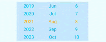
(1)設置待選項的字體大小和顏色效果
<DatePicker...ohos:normal_text_color="#00FFFF"ohos:normal_text_size="20fp">
</DatePicker>
(2)設置已選項的字體大小和顏色
<DatePicker...ohos:selected_text_color="#00FFFF"ohos:selected_text_size="20fp">
</DatePicker>
datePicker.setSelectedTextSize(40);
datePicker.setSelectedTextColor(new Color(Color.getIntColor("#FFA500")));
(3)設置操作項的字體顏色

<DatePicker...ohos:operated_text_color="#00FFFF">
</DatePicker>
datePicker.setOperatedTextColor(new Color(Color.getIntColor("#00FFFF")));
(4)設置DatePicker中所選文本邊距與普通文本邊距的比例
<DatePicker...ohos:selected_normal_text_margin_ratio="10">
</DatePicker>
datePicker.setSelectedNormalTextMarginRatio(10.0f)
(5)設置滾輪繞行(數據循環)

<DatePicker...ohos:wheel_mode_enabled="true">
</DatePicker>
datePicker.setWheelModeEnabled(true);
(6)設置選中日期的上下邊框
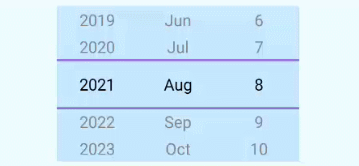
<DatePicker...ohos:top_line_element="#9370DB"ohos:bottom_line_element="#9370DB">
</DatePicker>
ShapeElement shape = new ShapeElement();
shape.setShape(ShapeElement.RECTANGLE);
shape.setRgbColor(RgbColor.fromArgbInt(0xFF9370DB));
datePicker.setDisplayedLinesElements(shape,shape);
(7)設置著色器顏色
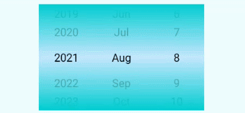
<DatePicker...ohos:shader_color="gray">
</DatePicker>
datePicker.setShaderColor(new Color(Color.getIntColor("#00CED1")));
DatePicker 了解更多
時間選擇器
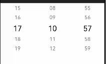
<TimePickerohos:id="$+id:time_picker"ohos:height="match_content"ohos:width="match_parent"ohos:normal_text_size="18fp"ohos:selected_text_size="26fp"/>
(1)設置字體屬性
<TimePicker...ohos:normal_text_color="#007DFF"ohos:normal_text_size="20fp"
/>
<TimePicker...ohos:selected_text_color="#007DFF"ohos:selected_text_size="20fp"
/>

<TimePicker...ohos:operated_text_color="#FF9912"
/>
(2)設置TimePicker中所選文本邊距與普通文本邊距的比例
<TimePicker...ohos:selected_normal_text_margin_ratio="10"
/>
(3)設置著色器顏色
<TimePicker...ohos:shader_color="#00BFFF"
/>
(4)設置選中時間的上下邊框
<TimePicker...ohos:bottom_line_element="#00BFFF"
/>
(5)設置12小時制下顯示樣式
AM/PM默認置于左側,如需位于右邊:
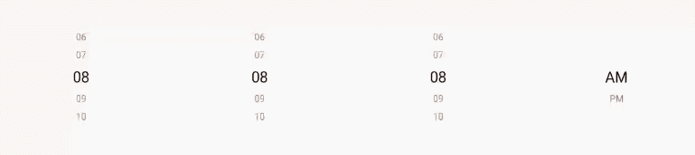
<TimePicker...ohos:am_pm_order="1"
/>
獲取時間
TimePicker timePicker = (TimePicker) findComponentById(ResourceTable.Id_time_picker);
int hour = timePicker.getHour();
int minute = timePicker.getMinute();
int second = timePicker.getSecond();
設置時間
timePicker.setHour(19);
timePicker.setMinute(18);
timePicker.setSecond(12);
響應時間改變事件
timePicker.setTimeChangedListener(new TimePicker.TimeChangedListener() {@Overridepublic void onTimeChanged(TimePicker timePicker, int hour, int minute, int second) {...}
});
范圍選擇設置及更多詳情
簡單:狀態組件
官方:Switch是切換單個設置開/關兩種狀態的組件

<Switchohos:id="$+id:btn_switch"ohos:height="60vp"ohos:width="100vp"ohos:top_margin="50fp"ohos:layout_alignment="center"ohos:text_state_off="OFF"ohos:text_state_on="ON"/>
(1)設置Switch在開啟和關閉時的文本

<Switch...ohos:text_state_off="OFF"ohos:text_state_on="ON"/>
Switch btnSwitch = (Switch) findComponentById(ResourceTable.Id_btn_switch);
btnSwitch.setStateOffText("OFF");
btnSwitch.setStateOnText("ON");
(2)設置響應Switch狀態改變的事件
btnSwitch.setCheckedStateChangedListener(new AbsButton.CheckedStateChangedListener() {// 回調處理Switch狀態改變事件@Overridepublic void onCheckedChanged(AbsButton button, boolean isChecked) {}
});

<Switchohos:id="$+id:btn_switch"ohos:height="60vp"ohos:width="100vp"ohos:top_margin="50fp"ohos:layout_alignment="center"ohos:text_state_off="OFF"ohos:text_state_on="ON"/>
public void onStart(Intent intent) {super.onStart(intent);super.setUIContent(ResourceTable.Layout_ability_main);//創建shape實例,并設置樣式// 開啟狀態下滑塊的樣式ShapeElement elementThumbOn = new ShapeElement();elementThumbOn.setShape(ShapeElement.OVAL);elementThumbOn.setRgbColor(RgbColor.fromArgbInt(0xFF1E90FF));elementThumbOn.setCornerRadius(50);// 關閉狀態下滑塊的樣式ShapeElement elementThumbOff = new ShapeElement();elementThumbOff.setShape(ShapeElement.OVAL);elementThumbOff.setRgbColor(RgbColor.fromArgbInt(0xFFFFFFFF));elementThumbOff.setCornerRadius(50);// 開啟狀態下軌跡樣式ShapeElement elementTrackOn = new ShapeElement();elementTrackOn.setShape(ShapeElement.RECTANGLE);elementTrackOn.setRgbColor(RgbColor.fromArgbInt(0xFF87CEFA));elementTrackOn.setCornerRadius(50);// 關閉狀態下軌跡樣式ShapeElement elementTrackOff = new ShapeElement();elementTrackOff.setShape(ShapeElement.RECTANGLE);elementTrackOff.setRgbColor(RgbColor.fromArgbInt(0xFF808080));elementTrackOff.setCornerRadius(50);Switch btnSwitch = (Switch) findComponentById(ResourceTable.Id_btn_switch);btnSwitch.setTrackElement(trackElementInit(elementTrackOn, elementTrackOff));btnSwitch.setThumbElement(thumbElementInit(elementThumbOn, elementThumbOff));}//設置軌跡樣式private StateElement trackElementInit(ShapeElement on, ShapeElement off){StateElement trackElement = new StateElement();trackElement.addState(new int[]{ComponentState.COMPONENT_STATE_CHECKED}, on);trackElement.addState(new int[]{ComponentState.COMPONENT_STATE_EMPTY}, off);return trackElement;}//設置滑塊樣式private StateElement thumbElementInit(ShapeElement on, ShapeElement off) {StateElement thumbElement = new StateElement();thumbElement.addState(new int[]{ComponentState.COMPONENT_STATE_CHECKED}, on);thumbElement.addState(new int[]{ComponentState.COMPONENT_STATE_EMPTY}, off);return thumbElement;}
Switch 了解更多
簡單:單選按鈕
官方:RadioButton用于多選一的操作,需要搭配RadioContainer使用,實現單選效果。

<RadioButtonohos:id="$+id:rb_1"ohos:height="40vp"ohos:width="match_content"ohos:text="A.Learning"ohos:margin="30fp"ohos:text_size="20fp"/>

<RadioButton...ohos:text_color_on="#00BFFF"ohos:text_color_off="#808080"/>
rBtn.setTextColorOn(new Color(Color.getIntColor("#0066FF")));
rBtn.setTextColorOff(new Color(Color.getIntColor("#505050")));
了解更多
簡單:單選按鈕租
官方:RadioContainer是RadioButton的容器,在其包裹下的RadioButton保證只有一個被選項。

<RadioContainerohos:id="$+id:radio_container"ohos:height="match_content"ohos:width="match_content"ohos:top_margin="32vp"ohos:layout_alignment="horizontal_center"><RadioButtonohos:id="$+id:radio_button_1"ohos:height="40vp"ohos:width="match_content"ohos:text="A.Learning"ohos:text_color_on="#00BFFF"ohos:text_color_off="#808080"ohos:text_size="20fp"/><RadioButtonohos:id="$+id:radio_button_2"ohos:height="40vp"ohos:width="match_content"ohos:text_color_on="#00BFFF"ohos:text_color_off="#808080"ohos:text="A.Innovation"ohos:text_size="20fp"/><RadioButtonohos:id="$+id:radio_button_3"ohos:height="40vp"ohos:width="match_content"ohos:text_color_on="#00BFFF"ohos:text_color_off="#808080"ohos:text="A.Benefit"ohos:text_size="20fp"/><RadioButtonohos:id="$+id:radio_button_4"ohos:height="40vp"ohos:width="match_content"ohos:text="A.Unity"ohos:text_color_on="#00BFFF"ohos:text_color_off="#808080"ohos:text_size="20fp"/></RadioContainer>
(1)設置響應RadioContainer狀態改變的事件
RadioContainer container = (RadioContainer) findComponentById(ResourceTable.Id_radio_container);
container.setMarkChangedListener(new RadioContainer.CheckedStateChangedListener() {@Overridepublic void onCheckedChanged(RadioContainer radioContainer, int index) {// 可參考下方場景實例代碼,自行實現...}
});
(2)根據索引值設置指定RadioButton為選定狀態
container.mark(0);
(3)清除RadioContainer中所有RadioButton的選定狀態
container.cancelMarks();
(4)設置RadioButton的布局方向:orientation設置為“horizontal”,表示橫向布局;orientation設置為“vertical”,表示縱向布局。默認為縱向布局。

<RadioContainer...ohos:orientation="horizontal">...
</RadioContainer>
container.setOrientation(Component.HORIZONTAL);

RadioContainer radioContainer = (RadioContainer) findComponentById(ResourceTable.Id_radio_container);int count = radioContainer.getChildCount();//給每個RadioButton 設置背景for (int i = 0; i < count; i++){((RadioButton) radioContainer.getComponentAt(i)).setButtonElement(createStateElement());}Text answer = (Text) findComponentById(ResourceTable.Id_text_checked);radioContainer.setMarkChangedListener((radioContainer1, index) -> {//參數一:格式符,參數二:ASCLL碼值 + 坐標 = 選擇的值answer.setText(String.format("[%c]",(char)('A'+index)));});<?xml version="1.0" encoding="utf-8"?>
<DirectionalLayoutxmlns:ohos="http://schemas.huawei.com/res/ohos"ohos:height="match_parent"ohos:width="match_parent"ohos:alignment="horizontal_center"ohos:orientation="vertical"ohos:left_padding="32vp"><Textohos:height="match_content"ohos:width="300vp"ohos:top_margin="32vp"ohos:text="Question:Which of the following options belong to fruit?"ohos:text_size="20fp"ohos:layout_alignment="left"ohos:multiple_lines="true"/><DirectionalLayoutohos:height="match_content"ohos:width="match_parent"ohos:orientation="horizontal"ohos:top_margin="8vp"><Textohos:height="match_content"ohos:width="match_content"ohos:text="Your Answer:"ohos:text_size="20fp"/><Textohos:id="$+id:text_checked"ohos:height="match_content"ohos:width="match_content"ohos:text_size="20fp"ohos:left_margin="18vp"ohos:text="[]"ohos:text_color="#FF3333"/></DirectionalLayout><RadioContainerohos:id="$+id:radio_container"ohos:height="match_content"ohos:width="200vp"ohos:layout_alignment="left"ohos:orientation="vertical"ohos:top_margin="16vp"ohos:left_margin="4vp"><RadioButtonohos:id="$+id:radio_button_1"ohos:height="40vp"ohos:width="match_content"ohos:text="A.Apple"ohos:text_size="20fp"ohos:text_color_on="#FF3333"/><RadioButtonohos:id="$+id:radio_button_2"ohos:height="40vp"ohos:width="match_content"ohos:text="B.Potato"ohos:text_size="20fp"ohos:text_color_on="#FF3333"/><RadioButtonohos:id="$+id:radio_button_3"ohos:height="40vp"ohos:width="match_content"ohos:text="C.Pumpkin"ohos:text_size="20fp"ohos:text_color_on="#FF3333"/><RadioButtonohos:id="$+id:radio_button_4"ohos:height="40vp"ohos:width="match_content"ohos:text="D.Vegetables"ohos:text_size="20fp"ohos:text_color_on="#FF3333"/></RadioContainer>
</DirectionalLayout>
了解更多
簡單:多選框
官方:可以實現選中和取消選中的功能。

<Checkboxohos:id="$+id:check_box"ohos:height="match_content"ohos:width="match_content"ohos:text="This is a checkbox"ohos:text_size="20fp" />
(1)配置Checkbox的選中和取消選中的狀態標志樣式

<Checkbox...ohos:check_element="$graphic:checkbox_check_element" />
graphic目錄下創建checkbox_check_element.xml、background_checkbox_checked.xml和background_checkbox_empty.xml三個文件。
checkbox_check_element.xml
<?xml version="1.0" encoding="utf-8"?>
<state-container xmlns:ohos="http://schemas.huawei.com/res/ohos"><item ohos:state="component_state_checked" ohos:element="$graphic:background_checkbox_checked"/><item ohos:state="component_state_empty" ohos:element="$graphic:background_checkbox_empty"/>
</state-container>
<?xml version="1.0" encoding="UTF-8" ?>
<shape xmlns:ohos="http://schemas.huawei.com/res/ohos"ohos:shape="rectangle"><solidohos:color="#00BFC9"/>
</shape>
background_checkbox_empty.xml
<?xml version="1.0" encoding="UTF-8" ?>
<shape xmlns:ohos="http://schemas.huawei.com/res/ohos"ohos:shape="rectangle"><solidohos:color="#000000"/>
</shape>
(2)設置Checkbox文字顏色的效果

<Checkbox...ohos:text_color_on="#00AAEE"ohos:text_color_off="#000000" />
(3)設置Checkbox的選中狀態
checkbox.setChecked(true);
(4)設置不同狀態之間的切換:如果當前為選中狀態,那么將變為未選中;如果當前是未選中狀態,將變為選中狀態
checkbox.toggle();
(5) 設置響應Checkbox狀態變更的事件
// state表示是否被選中
checkbox.setCheckedStateChangedListener((component, state) -> {// 狀態改變的邏輯...
});

public class MainAbilitySlice extends AbilitySlice {// 保存最終選中的結果private Set<String> selectedSet = new HashSet<>();@Overridepublic void onStart(Intent intent) {super.onStart(intent);super.setUIContent(ResourceTable.Layout_ability_main);initCheckbox();}// 初始化Checkboxprivate void initCheckbox() {Checkbox checkbox1 = (Checkbox) findComponentById(ResourceTable.Id_check_box_1);checkbox1.setButtonElement(elementButtonInit());checkbox1.setCheckedStateChangedListener((component, state) -> {if (state) {selectedSet.add("A");} else {selectedSet.remove("A");}showAnswer();});Checkbox checkbox2 = (Checkbox) findComponentById(ResourceTable.Id_check_box_2);checkbox2.setButtonElement(elementButtonInit());checkbox2.setCheckedStateChangedListener((component, state) -> {if (state) {selectedSet.add("B");} else {selectedSet.remove("B");}showAnswer();});Checkbox checkbox3 = (Checkbox) findComponentById(ResourceTable.Id_check_box_3);checkbox3.setButtonElement(elementButtonInit());checkbox3.setCheckedStateChangedListener((component, state) -> {if (state) {selectedSet.add("C");} else {selectedSet.remove("C");}showAnswer();});Checkbox checkbox4 = (Checkbox) findComponentById(ResourceTable.Id_check_box_4);checkbox4.setButtonElement(elementButtonInit());checkbox4.setCheckedStateChangedListener((component, state) -> {if (state) {selectedSet.add("D");} else {selectedSet.remove("D");}showAnswer();});}// 設置Checkbox背景private StateElement elementButtonInit() {ShapeElement elementButtonOn = new ShapeElement();elementButtonOn.setRgbColor(RgbPalette.RED);elementButtonOn.setShape(ShapeElement.OVAL);ShapeElement elementButtonOff = new ShapeElement();elementButtonOff.setRgbColor(RgbPalette.BLACK);elementButtonOff.setShape(ShapeElement.OVAL);StateElement checkElement = new StateElement();checkElement.addState(new int[]{ComponentState.COMPONENT_STATE_CHECKED}, elementButtonOn);checkElement.addState(new int[]{ComponentState.COMPONENT_STATE_EMPTY}, elementButtonOff);return checkElement;}// 顯示結果private void showAnswer() {Text answerText = (Text) findComponentById(ResourceTable.Id_text_answer);String answer = selectedSet.toString();answerText.setText(answer);}
}
<?xml version="1.0" encoding="utf-8"?>
<DirectionalLayoutxmlns:ohos="http://schemas.huawei.com/res/ohos"ohos:height="match_parent"ohos:width="match_parent"ohos:orientation="vertical"ohos:left_padding="40vp"ohos:top_padding="40vp"><DirectionalLayoutohos:height="match_content"ohos:width="match_parent"ohos:orientation="horizontal"><Textohos:height="match_content"ohos:width="match_content"ohos:text_size="18fp"ohos:text="Which of the following are fruits?"/><Textohos:id="$+id:text_answer"ohos:height="match_content"ohos:width="match_content"ohos:left_margin="20vp"ohos:text_size="20fp"ohos:text_color="#FF3333"ohos:text="[]" /></DirectionalLayout><Checkboxohos:id="$+id:check_box_1"ohos:top_margin="40vp"ohos:height="match_content"ohos:width="match_content"ohos:text="A Apples"ohos:text_size="20fp"ohos:text_color_on="#FF3333"ohos:text_color_off="#000000"/><Checkboxohos:id="$+id:check_box_2"ohos:top_margin="40vp"ohos:height="match_content"ohos:width="match_content"ohos:text="B Bananas"ohos:text_size="20fp"ohos:text_color_on="#FF3333"ohos:text_color_off="#000000"/><Checkboxohos:id="$+id:check_box_3"ohos:top_margin="40vp"ohos:height="match_content"ohos:width="match_content"ohos:text="C Strawberries"ohos:text_size="20fp"ohos:text_color_on="#FF3333"ohos:text_color_off="#000000" /><Checkboxohos:id="$+id:check_box_4"ohos:top_margin="40vp"ohos:height="match_content"ohos:width="match_content"ohos:text="D Potatoes"ohos:text_size="20fp"ohos:text_color_on="#FF3333"ohos:text_color_off="black" />
</DirectionalLayout>
Checkbox 了解更多
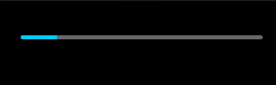
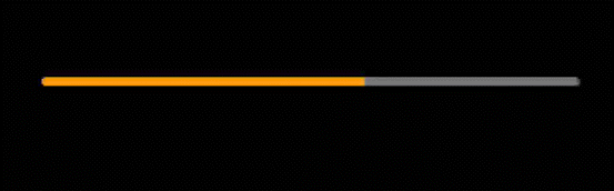
簡單:水平或垂直進度條
官方:ProgressBar用于顯示內容或操作的進度。

<ProgressBarohos:progress_width="10vp"ohos:height="60vp"ohos:width="200fp"ohos:max="100"ohos:min="0"ohos:progress="60"/>
(1)設置ProgressBar方向為垂直

<ProgressBarohos:progress_width="10vp"ohos:height="150vp"ohos:width="200fp"ohos:max="100"ohos:orientation="vertical"ohos:min="0"ohos:progress="60"/>
(2)設置當前進度
<ProgressBar...ohos:progress="60"/>
progressBar.setProgressValue(60);
(3)設置最大和最小值
<ProgressBar...ohos:max="400"ohos:min="0"/>
progressBar.setMaxValue(400);
progressBar.setMinValue(0);
(4)設置ProgressBar進度顏色
<ProgressBar...ohos:progress_element="#FF9900" />
(5)設置底色顏色效果
<ProgressBar...ohos:background_instruct_element="#FFFFFF" />
(6)設置ProgressBar分割線
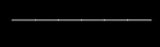
<ProgressBar...ohos:divider_lines_enabled="true"ohos:divider_lines_number="5" />
progressBar.enableDividerLines(true);
progressBar.setDividerLinesNumber(5);
(7)設置ProgressBar分割線顏色
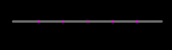
progressBar.setDividerLineColor(Color.MAGENTA);
(8)設置ProgressBar提示文字
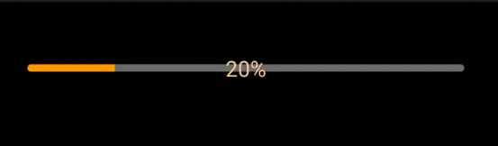
<ProgressBar...ohos:progress_hint_text="20%"ohos:progress_hint_text_color="#FFCC99" />
ProgressBar 了解更多
簡單:圓形進度條
官方:RoundProgressBar繼承自ProgressBar,擁有ProgressBar的屬性,在設置同樣的屬性時用法和ProgressBar一致,用于顯示環形進度。
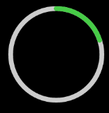
<RoundProgressBarohos:id="$+id:round_progress_bar"ohos:height="200vp"ohos:width="200vp"ohos:progress_width="10vp"ohos:progress="20"ohos:progress_color="#47CC47"/>
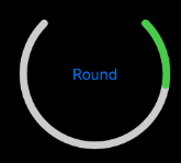
<RoundProgressBarohos:id="$+id:round_progress_bar"ohos:height="200vp"ohos:width="200vp"ohos:progress_width="10vp"ohos:start_angle="45"ohos:max_angle="270"ohos:progress="20"ohos:progress_hint_text="Round"ohos:progress_hint_text_color="#007DFF"ohos:progress_color="#47CC47"/>
RoundProgressBar 更多
簡單:提示對話框
官方:ToastDialog是在窗口上方彈出的對話框,是通知操作的簡單反饋。ToastDialog會在一段時間后消失,在此期間,用戶還可以操作當前窗口的其他組件。

Button button = (Button) findComponentById(ResourceTable.Id_btn_dianwo);button.setClickedListener(new Component.ClickedListener() {@Overridepublic void onClick(Component component) {//創建一個ToastDialognew ToastDialog(getContext()).setText("This is a ToastDialog").show();}});
<Buttonohos:id="$+id:btn_dianwo"ohos:height="match_content"ohos:width="match_parent"ohos:layout_alignment="center"ohos:text="點我"ohos:margin="40fp"ohos:text_size="25fp"ohos:background_element="#FF53C3DE"/>
(1)設置位置
new ToastDialog(getContext()).setText("This is a ToastDialog displayed in the middle").setAlignment(LayoutAlignment.CENTER).show();

新建:layout_toast.xml
<?xml version="1.0" encoding="utf-8"?>
<DirectionalLayoutxmlns:ohos="http://schemas.huawei.com/res/ohos"ohos:height="match_content"ohos:width="match_content"ohos:orientation="vertical"><Textohos:id="$+id:msg_toast"ohos:height="match_content"ohos:width="match_content"ohos:left_padding="16vp"ohos:right_padding="16vp"ohos:top_padding="4vp"ohos:bottom_padding="4vp"ohos:layout_alignment="center"ohos:text_size="16fp"ohos:text="This is a ToastDialog for the customized component"ohos:background_element="$graphic:background_toast_element"/>
</DirectionalLayout>
background_toast_element.xml
<?xml version="1.0" encoding="utf-8"?>
<shape xmlns:ohos="http://schemas.huawei.com/res/ohos"ohos:shape="rectangle"><cornersohos:radius="30vp"/><solidohos:color="#66808080"/>
</shape>
Button button = (Button) findComponentById(ResourceTable.Id_btn_dianwo);button.setClickedListener(new Component.ClickedListener() {@Overridepublic void onClick(Component component) {//自定義ToastDialog的ComponentDirectionalLayout toastLayout = (DirectionalLayout) LayoutScatter.getInstance(MainAbilitySlice.this).parse(ResourceTable.Layout_layout_toast, null, false);new ToastDialog(getContext()).setContentCustomComponent(toastLayout).setSize(DirectionalLayout.LayoutConfig.MATCH_CONTENT, DirectionalLayout.LayoutConfig.MATCH_CONTENT).setAlignment(LayoutAlignment.CENTER).show();}});

新建:layout_toast_and_image.xml
<?xml version="1.0" encoding="utf-8"?>
<DirectionalLayoutxmlns:ohos="http://schemas.huawei.com/res/ohos"ohos:height="match_content"ohos:width="match_content"ohos:orientation="horizontal"><Imageohos:width="30vp"ohos:height="30vp"ohos:scale_mode="inside"ohos:image_src="$media:icon"/><Textohos:id="$+id:msg_toast"ohos:height="match_content"ohos:width="match_content"ohos:background_element="$graphic:background_toast_element"ohos:bottom_padding="4vp"ohos:layout_alignment="vertical_center"ohos:left_padding="16vp"ohos:right_padding="16vp"ohos:text="This is a ToastDialog with An Image"ohos:text_size="16fp"ohos:top_padding="4vp"/>
</DirectionalLayout>
background_toast_element.xml
<?xml version="1.0" encoding="utf-8"?>
<shape xmlns:ohos="http://schemas.huawei.com/res/ohos"ohos:shape="rectangle"><cornersohos:radius="30vp"/><solidohos:color="#66808080"/>
</shape>
Button button = (Button) findComponentById(ResourceTable.Id_btn_dianwo);button.setClickedListener(new Component.ClickedListener() {@Overridepublic void onClick(Component component) {DirectionalLayout layout = (DirectionalLayout) LayoutScatter.getInstance(MainAbilitySlice.this).parse(ResourceTable.Layout_layout_toast_and_image, null, false);new ToastDialog(getContext()).setContentCustomComponent(layout).setSize(DirectionalLayout.LayoutConfig.MATCH_CONTENT, DirectionalLayout.LayoutConfig.MATCH_CONTENT).setAlignment(LayoutAlignment.CENTER).show();}});
ToastDialog 更多
簡單:滑動視圖
官方:ScrollView是一種帶滾動功能的組件,它采用滑動的方式在有限的區域內顯示更多的內容。

<ScrollViewohos:id="$+id:scrollview"ohos:height="300vp"ohos:width="300vp"ohos:background_element="#FFDEAD"ohos:top_margin="32vp"ohos:bottom_padding="16vp"ohos:layout_alignment="horizontal_center"><DirectionalLayoutohos:height="match_content"ohos:width="match_content"><Imageohos:width="300vp"ohos:height="match_content"ohos:top_margin="16vp"ohos:image_src="$media:Android"/><Imageohos:width="300vp"ohos:height="match_content"ohos:top_margin="16vp"ohos:image_src="$media:AI"/><Imageohos:width="300vp"ohos:height="match_content"ohos:top_margin="16vp"ohos:image_src="$media:AIOT"/><Imageohos:width="300vp"ohos:height="match_content"ohos:top_margin="16vp"ohos:image_src="$media:HarmonyOS"/></DirectionalLayout></ScrollView>

(1)點擊按鈕,根據像素數平滑滾動。
ScrollView scrollView = (ScrollView) findComponentById(ResourceTable.Id_scrollview);Button btnScroll= (Button) findComponentById(ResourceTable.Id_btnScroll);//根據像素數平滑滾動btnScroll.setClickedListener(component -> {scrollView.fluentScrollByY(300);});
<?xml version="1.0" encoding="utf-8"?>
<DirectionalLayoutxmlns:ohos="http://schemas.huawei.com/res/ohos"ohos:height="match_parent"ohos:width="match_parent"ohos:orientation="vertical"ohos:left_padding="40vp"ohos:top_padding="40vp"><ScrollViewohos:id="$+id:scrollview"ohos:height="300vp"ohos:width="300vp"ohos:background_element="#FFDEAD"ohos:top_margin="32vp"ohos:bottom_padding="16vp"ohos:layout_alignment="horizontal_center"><DirectionalLayoutohos:height="match_content"ohos:width="match_content"><Imageohos:width="300vp"ohos:height="match_content"ohos:top_margin="16vp"ohos:image_src="$media:Android"/><Imageohos:width="300vp"ohos:height="match_content"ohos:top_margin="16vp"ohos:image_src="$media:AI"/><Imageohos:width="300vp"ohos:height="match_content"ohos:top_margin="16vp"ohos:image_src="$media:AIOT"/><Imageohos:width="300vp"ohos:height="match_content"ohos:top_margin="16vp"ohos:image_src="$media:HarmonyOS"/></DirectionalLayout></ScrollView><Buttonohos:id="$+id:btnScroll"ohos:height="match_content"ohos:width="match_parent"ohos:background_element="#FFF10B0B"ohos:text_size="20vp"ohos:text_color="#FFFAF6F6"ohos:top_margin="15fp"ohos:text="Scroll By Y:300"/></DirectionalLayout>
(2)點擊按鈕,平滑滾動到指定位置

scrollView.fluentScrollYTo(500);
(3)設置水平方向

<ScrollView...ohos:rebound_effect="true">...
</ScrollView>
(4)設置回彈效果

<ScrollView...ohos:rebound_effect="true">...
</ScrollView>
scrollView.setReboundEffect(true);
(5)設置縮放匹配效果
<ScrollView...ohos:match_viewport="true">...
</ScrollView>
scrollView.setMatchViewportEnabled(true);
ScrollView 更多
簡單:列表
官方:ListContainer是用來呈現連續、多行數據的組件,包含一系列相同類型的列表項。

<?xml version="1.0" encoding="utf-8"?>
<DirectionalLayoutxmlns:ohos="http://schemas.huawei.com/res/ohos"ohos:height="match_parent"ohos:width="match_parent"ohos:orientation="vertical"ohos:left_padding="40vp"ohos:top_padding="40vp"><ListContainerohos:id="$+id:list_container"ohos:height="200vp"ohos:width="300vp"ohos:layout_alignment="horizontal_center"/></DirectionalLayout>
<?xml version="1.0" encoding="utf-8"?>
<DirectionalLayoutxmlns:ohos="http://schemas.huawei.com/res/ohos"ohos:height="match_content"ohos:width="match_parent"ohos:left_margin="16vp"ohos:right_margin="16vp"ohos:orientation="vertical"><Textohos:id="$+id:item_index"ohos:height="match_content"ohos:width="match_content"ohos:padding="4vp"ohos:text="Item0"ohos:text_size="20fp"ohos:layout_alignment="center"/>
</DirectionalLayout>
public class SampleItem {private String name;public SampleItem(String name) {this.name = name;}public String getName() {return name;}public void setName(String name) {this.name = name;}
}
import ohos.aafwk.ability.AbilitySlice;
import ohos.agp.components.*;
import java.util.List;
public class SampleItemProvider extends BaseItemProvider {private List<SampleItem> list;private AbilitySlice slice;public SampleItemProvider(List<SampleItem> list, AbilitySlice slice) {this.list = list;this.slice = slice;}@Overridepublic int getCount() {return list == null ? 0 : list.size();}@Overridepublic Object getItem(int position) {if (list != null && position >= 0 && position < list.size()){return list.get(position);}return null;}@Overridepublic long getItemId(int position) {return position;}@Overridepublic Component getComponent(int position, Component convertComponent, ComponentContainer componentContainer) {final Component cpt;if (convertComponent == null) {cpt = LayoutScatter.getInstance(slice).parse(ResourceTable.Layout_item_sample, null, false);} else { cpt = convertComponent;}SampleItem sampleItem = list.get(position);Text text = (Text) cpt.findComponentById(ResourceTable.Id_item_index);text.setText(sampleItem.getName());return cpt;}
}
public class MainAbilitySlice extends AbilitySlice {@Overridepublic void onStart(Intent intent) {super.onStart(intent);super.setUIContent(ResourceTable.Layout_ability_main);initListContainer();}//初始化數據private void initListContainer() {ListContainer listContainer = (ListContainer) findComponentById(ResourceTable.Id_list_container);List<SampleItem> list = getData();SampleItemProvider sampleItemProvider = new SampleItemProvider(list, this);listContainer.setItemProvider(sampleItemProvider);}private ArrayList<SampleItem> getData() {ArrayList<SampleItem> list = new ArrayList<>();for (int i = 0; i <= 30; i++) {list.add(new SampleItem("Item" + i));}return list;}@Overridepublic void onActive() {super.onActive();}@Overridepublic void onForeground(Intent intent) {super.onForeground(intent);}
}
(1)設置響應點擊事件

listContainer.setItemClickedListener((container, component, position, id) -> {SampleItem item = (SampleItem) listContainer.getItemProvider().getItem(position);new ToastDialog(this).setText("you clicked:" + item.getName())// Toast顯示在界面中間.setAlignment(LayoutAlignment.CENTER).show();
});
(2)設置響應長按事件
listContainer.setItemLongClickedListener((container, component, position, id) -> {SampleItem item = (SampleItem) listContainer.getItemProvider().getItem(position);new ToastDialog(this).setText("you long clicked:" + item.getName()).setAlignment(LayoutAlignment.CENTER).show();return false;
});
ListContainer的樣式設置相關的接口如下:
(1)設置水平布局

<ListContainer...ohos:orientation="horizontal"/>
listContainer.setOrientation(Component.HORIZONTAL);
(2)自定義樣式
實現:在子布局和ListContainer布局中添加背景色

listContainer.setContentOffSet(32, 16);
<DirectionalLayout...ohos:background_element="#FAEBD7">...
</DirectionalLayout>
<ListContainer...ohos:background_element="#FFDEAD"/>
(3)設置回彈效果

<ListContainer...ohos:rebound_effect="true"/>
listContainer.setReboundEffect(true);
listContainer.setReboundEffectParams(40, 0.6f, 20);
(4)設置著色器顏色
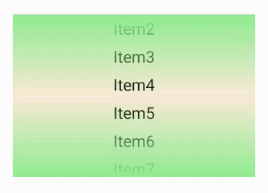
<ListContainer...ohos:shader_color="#90EE90"/>
listContainer.setShaderColor(new Color(Color.getIntColor("#90EE90")));

ListContainer 更多
簡單:滑動頁面指示器
官方:PageSliderIndicator,需配合PageSlider使用,指示在PageSlider中展示哪個界面。

🔺這里是在之前的 PageSlider組件上新增代碼進行實現,學習或源碼可參考:
Harmony OS — PageSlider滑動頁面
<PageSliderIndicatorohos:id="$+id:indicator"ohos:height="match_content"ohos:width="match_content"ohos:padding="8vp"ohos:layout_alignment="horizontal_center"ohos:top_margin="16vp"ohos:background_element="#55FFC0CB"/>
PageSliderIndicator indicator = (PageSliderIndicator)findComponentById(ResourceTable.Id_indicator);ShapeElement normalElement = new ShapeElement();normalElement.setRgbColor(RgbColor.fromArgbInt(0xADD8E6));normalElement.setAlpha(168);normalElement.setShape(ShapeElement.OVAL);normalElement.setBounds(0, 0, 32, 32);ShapeElement selectedElement = new ShapeElement();selectedElement.setRgbColor(RgbColor.fromArgbInt(0x00BFFF));selectedElement.setAlpha(168);selectedElement.setShape(ShapeElement.OVAL);selectedElement.setBounds(0, 0, 48, 48);indicator.setItemElement(normalElement, selectedElement);indicator.setItemOffset(60);indicator.setPageSlider(pageSlider);
(1)關聯PageSlider
indicator.setPageSlider(pageSlider);
(2)響應頁面更改事件
indicator.addOnSelectionChangedListener(new PageSlider.PageChangedListener() {@Overridepublic void onPageSliding(int i, float v, int i1) {}@Overridepublic void onPageSlideStateChanged(int i) {}@Overridepublic void onPageChosen(int i) {}});
(3)設置所選指導航點的位置
indicator.setSelected(2);
此方法也會改變關聯的PageSlider對象中的頁面。
(4)自定義導航點的背景
除了上述使用Java創建背景外,也可以使用XML方式創建。

<?xml version="1.0" encoding="utf-8"?>
<shape xmlns:ohos="http://schemas.huawei.com/res/ohos"ohos:shape="rectangle"><cornersohos:radius="16px"/><boundsohos:top="0"ohos:left="0"ohos:right="64px"ohos:bottom="32px"/><solidohos:color="#00BFFF"/>
</shape>
<?xml version="1.0" encoding="utf-8"?>
<shape xmlns:ohos="http://schemas.huawei.com/res/ohos"ohos:shape="oval"><boundsohos:top="0"ohos:left="0"ohos:right="32px"ohos:bottom="32px"/><solidohos:color="#ADD8E6"/>
</shape>
ShapeElement normalElement = new ShapeElement(this, ResourceTable.Graphic_unselected_page_bg_element);ShapeElement selectedElement = new ShapeElement(this, ResourceTable.Graphic_selected_page_bg_element);indicator.setItemElement(normalElement, selectedElement);
(5)設置導航點之間的偏移量
indicator.setItemOffset(60);
PageSliderIndicator 更多
喜歡記得點個贊喲,我是王睿,很高興認識大家!
版权声明:本站所有资料均为网友推荐收集整理而来,仅供学习和研究交流使用。

工作时间:8:00-18:00
客服电话
电子邮件
admin@qq.com
扫码二维码
获取最新动态
