层叠样式表是一种用来表现HTML(标准通用标记语言的一个应用)或XML(标准通用标记语言的一个子集)等文件样式的计算机语言。
CSS布局。CSS目前最新版本为CSS3,是能够真正做到网页表现与内容分离的一种样式设计语言。相对于传统HTML的表现而言,CSS能够对网页中的对象的位置排版进行像素级的精确控制,支持几乎所有的字体字号样式,拥有对网页对象和模型样式编辑的能力,并能够进行初步交互设计,是目前基于文本展示最优秀的表现设计语言。CSS能够根据不同使用者的理解能力,简化或者优化写法,针对各类人群,有较强的易读性。
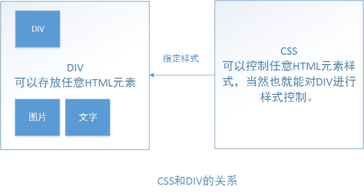
DIV是层叠样式表中的定位技术,全称DIVision,即为划分。有时可以称其为图层。
<div> 可定义文档中的分区或节(division/section)。
<div> 标签可以把文档分割为独立的、不同的部分。它可以用作严格的组织工具,并且不使用任何格式与其关联。
PS:
简单的理解就是CSS是用来控制HTML的样式的,使HTML样式和内容分离,DIV是HTML的一个独立单位,可以用CSS来任意控制位置,实现定位。
DIV可以放任意HTMl元素,DIV也是可以嵌套放置的。
1.符合W3C的标准。
2.内容样式分离,对搜索引擎更加友好。
3.样式调整更为方便。
4.使代码更为整洁,尤其是在大型项目中,整洁的代码,开发效率更高。
使用css+div之后,自然而然的就不在去使用table的布局方法了,但是table布局显示数据的便捷性,是css+div无法替代,故该使用table时,还是要使用table,不要为了统一而将本该简单的问题复杂化。
html中(内部css):
<标签style="样式属性: 样式值1 样式值2;">内容</标签>
css中(外部css):
如果是外部css,则首先要引用css文件,格式为:
<link type=”text/css” rel=”stylesheet” href=”路径” />
css文件中选择器的格式为:
选择器名 {
样式属性: 样式值1 样式值2;(支持多个样式值的样式属性)
样式属性: 样式值;
}
实例:
<!-- Doctype:文档类型 指定dtd:说明当前这个html版本 -->
<!DOCTYPE html>
<html><head><title>HTML1.html</title><!-- 关键字 用于SEO 给搜索引擎爬虫用的 --><meta http-equiv="keywords" content="keyword1,keyword2,keyword3"><!-- 文档的描述 --><meta http-equiv="description" content="this is my page"><!-- 给浏览器文件的编码格式  --><meta http-equiv="content-type" content="text/html; charset=UTF-8"><!-- 引入CSS --><!--<link rel="stylesheet" type="text/css" href="./styles.css">--><style type="text/css">.style1{font-size: 20px;color: red;font-weight:bold;font-style: italic;text-decoration: underline;}img{/*使用滤镜将图片变成黑白色,在低版本的浏览器有用*/filter: gray;}</style></head><body><span style="font-size: 30px;color: blue;">栏目一</span><span style="font-size: 10px;color: red;font-style: italic;">栏目二</span><span style="font-size: 30px;color: yellow;font-weight: bold;">栏目三</span><span style="font-size: 30px;color: green;font-weight: lighter;">栏目四</span><span style="font-size: 30px;color: green;font-weight: bolder;">栏目五</span><br/><span class="style1">栏目一</span><span class="style1">栏目二</span><span class="style1">栏目三</span><span class="style1">栏目四</span><span class="style1">栏目五</span><br/><img src="../resource/images/1.jpg" alt='图片' width='100px'/><img src="../resource/images/image01.jpg" width='100px'></img></body>
</html>基本语法:
.类选择器名{
属性名:属性值;
…
}
PS:在元素中类选择器是可以多个一起使用的,如果在多个类选择器中,同意属性样式重复定义,那么,以后面那个选择器为准。
其格式为:<span class="style1 style2 style3">内容</span>
实例:
css中
css中
.style1{
font-size: 20px;
font-weight: bold;
background-color: purple;
}
html中
<span class="style1">内容</span>
基本语法:
#id选择器名{
属性名:属性值;
}
PS:在元素中ID选择器只能使用一个,其优先级也是最高的。
实例:
css中
#style2{
font-size: 30px;
background-color: skyblue;
}
html中
<span id="style2">内容</span>
基本语法:
body{
color:silver;
}
PS:标签选择器就是对HTML元素的样式进行定义。如果不是HTML元素,即使定义也无法识别,例如:aaa{ font-size: 20px;} <aaa>aaaa</aaa>这样不存在于HTML标签库的元素是不能被识别并且定义的。
如果希望所有的元素都符合某一种样式,可以使用通配符选择器。
基本语法:
/*使用通配符选择器对外边距和内边距清零*/
*{
margin: 0;
padding: 0;
}
PS:通配符选择器可以和父子选择器结合使用,接下来会有相应内容。
注意事项:
当同一个元素被下列选择器修饰时,优先级的大小为:
ID选择器>类选择器>标签选择器>通配符选择器
原因:越特殊的选择器,优先级越高。
父子选择器是在已定义类或者ID选择器的标签中,采取递进的方式对子孙元素定义样式。
基本语法:
css中
#style2 span{
font-style:italic;
color:red;
}
html中
<span id="style2">这是一则<span>非常重要</span>的新闻</span><br/>
注意事项:
(1)子选择器标签必须是html可以识别的标记
(2)父子选择器可以有多级
(3)父子选择器可以适用于id选择器和class选择器
群组选择器
在css文件中,如果有多个类/id选择器,它们都有相同的部分,我们可以把相同的css样式放在一起,用,隔开,这样就是一个群组选择器。
实例:
/*招生广告*/
.ad_stu{
width :136px;
background-color:#FC7E8C;
margin:5px 0 0 5px;
}
/*广告2*/
.ad_2{
width :457px;
background-color:#7CF574;
margin:5px 0 0 6px;
}
/*房地产广告*/
.ad_house{
height:196px;
background-color:#7CF574;
margin:5px 0 0 5px;
}
.ad_stu,.ad_2,.ad_house{
width :152px;
float:left;
}
综合实例:
<!DOCTYPE html>
<html><head><title>HTML2.html</title><meta http-equiv="keywords" content="keyword1,keyword2,keyword3"><meta http-equiv="description" content="this is my page"><meta http-equiv="content-type" content="text/html; charset=UTF-8"><link rel="stylesheet" type="text/css" href="../resource/css/HTML2.css"></head><body>新闻<br/><span class="style1">新闻1</span><span class="style1">新闻2</span><span class="style1 style3">新闻3</span><span class="style1">新闻4</span><span class="style1" id="style2">新闻5</span><br/><span id="style2"><span>非<span>常</span>重要</span>的消息</span><br/><a href="http://www.baidu.com">百度</a></body>
</html>
@CHARSET "UTF-8";
/*类选择器*/
.style1 {font-weight: bold;font-size: 20px;background-color: pink;color: blue;
}.style3 {font-style: italic;text-decoration: underline;color: green;
}/*ID选择器*/
#style2 {font-weight: 30px;background-color: silver;color: black;
}/* 父子选择器 */
#style2 span {font-style: italic;color: red;
}#style2 span span {font-weight: bold;color: green;
}/*标签选择器*/
body {color: yellow;
}/* 通配符选择器 */
* {margin: 5px 0px 0px 0px;padding: 0px;
}/*超链接的4种状态*/
/* a:link - 普通的、未被访问的链接 a:visited - 用户已访问的链接 a:hover - 鼠标指针位于链接的上方 a:active - 链接被点击的时刻 */
a:LINK {color: black;text-decoration: none;
}a:VISITED {color: silver;text-decoration: overline;
}
<pre name="code" class="css">a:HOVER {text-decoration: underline;
}
<!DOCTYPE html>
<html><head><title>HTML4.html</title><meta http-equiv="keywords" content="keyword1,keyword2,keyword3"><meta http-equiv="description" content="this is my page"><meta http-equiv="content-type" content="text/html; charset=UTF-8"><link rel="stylesheet" type="text/css" href="../resource/css/HTML4.css" /></head><body><font class="s1">梁山排行榜</font><br/><span class="sj">宋江</span><br/><span class="lyw">卢员外</span><br/><span class="wy">吴用</span><br/><span class="bzt">豹子头</span><br/><span class="ddgs">大刀关胜</span><br/></body>
</html>
@CHARSET "UTF-8";
.s1 {font-size: 30px;color: blue;
}.sj {font-style: italic;color: red;
}.lyw {
}.wy {font-style: italic;text-decoration: underline;
}.bzt {
}.ddgs{
}.sj,.lyw,.wy,.bzt,.ddgs {background-color: gray;font-weight: bold;
}行内元素,又叫内联元素,内联元素只能容纳文本或者其他内联元素。
常见内联元素:
<span><a><input><img>
特点是:只占内容的宽度,默认不换行,行内元素一般放文本或者其它的行。
块元素一般都从新行开始,可以容纳文本,其它内联元素和其它块元素,即使内容不能占满一行,块元素也要把整行占满。
常见块元素:
<div><p>
特点是:不管内容有多少,都要换行,同时占满整行,块元素可以放文本,行内元素,块元素。
注意事项:
1、一些css属性对行内元素不生效,例如margin,left,但是这个是于浏览器版本类型有关的。
2、如果在行内元素里面放置块元素,行内元素将被截断,也就是说因为块元素必须要占满一行,那么这样做的结果就是一行变为三行,分别是,行内元素,块元素,行内元素。
3、div就是块元素,那么就拥有块元素的一切特性。
html中:
<span class="s1">行内元素1</span>
<span class="s1">行内元素2</span>
<div class="s2">块元素1</div>
<div class="s2">块元素2</div>
css中:
.s1{
background-color: silver;
font-size:20px;
}
.s2{
background-color: skyblue;
font-size:30px;
font-style: italic;
}
块元素和行内元素的转换
如果我们希望一个元素按照块元素的方式显示,则: display:block;
<span style=”display:block;” class=”s2”>abc</span>
如果我们希望一个元素按照行内元素的方式显示,则: display:inline;
<div style=”display:inline;” class=”s2”>hello</div>
同样的,这也可以写到CSS中。
PS:还有个常见的叫inline-block(行内块),它兼顾行内和块元素的特性,占用内容宽度,并且支持width,margin等的设置,也能看做块元素。这就是为什么叫做行内块元素的原因了。
综合实例:
<!DOCTYPE html>
<html><head><title>HTML6.html</title><meta http-equiv="keywords" content="keyword1,keyword2,keyword3"><meta http-equiv="description" content="this is my page"><meta http-equiv="content-type" content="text/html; charset=UTF-8"><link rel="stylesheet" type="text/css" href="../resource/css/HTML6.css" /></head><body><div class="s1">第一个div</div><span class="s2">第一个span</span><span class="s3">第二个span</span><div class="s4">第二个div</div>Hello World</body>
</html>
@CHARSET "UTF-8";
.s1 {text-decoration: underline;font-size: 20px;font-weight: bold;
}.s2 {color: red;font-size: 25px;font-style: italic;
}.s3 {color: yellow;font-weight: bolder;font-size: 15px;display: block;
}.s4 {text-decoration: line-through;display: inline;
}.s1,.s2,.s3,.s4 {background-color: silver;
}盒子模型是CSS中最重要的内容之一,其核心思想就是将HTML中的所有元素都看成是盒子,盒子里有实际内容(内容content),盒子可能有填充物(内边距padding),盒子可能有壳(边框border),盒子可能和其他盒子有距离(外边距margin),由这些东西就构成了盒子模型。
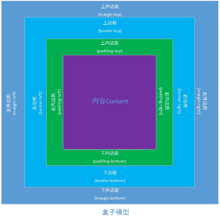
细节说明:
1、任何一元素都可以看做是一个盒子。
2、嵌套盒子模型的参照物不一样,则使用的属性不一样。外层盒子的panding等价于内层盒子的margin。
3、padding值过大会改变盒子的大小,margin值过大会挤到盒子外面,但盒子并没有变化。
4、如果不想破坏盒子模型的整体外观的话,尽量少使用padding。
综合实例:
<!DOCTYPE html>
<html><head><title>HTML7.html</title><meta http-equiv="keywords" content="keyword1,keyword2,keyword3"><meta http-equiv="description" content="this is my page"><meta http-equiv="content-type" content="text/html; charset=UTF-8"><link rel="stylesheet" type="text/css" href="../resource/css/HTML7.css" /></head><body><div class="s1"><img src="../resource/images/1.jpg" /></div></body>
</html>
@CHARSET "UTF-8";
body {border: 1px solid red;/* 给body指定了border的宽度,样式,颜色 */width: 800px;height: 1000px;margin: 0 auto;/* 边距为0,居中 */
}.s1 {width: 50px;height: 52px;border: 1px solid blue;margin-top: 10px;margin-left: 100px;border-top: 1px solid red;
}.s1 img {width: 40px;margin-top: 5px;margin-left: 5px;
}
<!DOCTYPE html>
<html><head><title>HTML8.html</title><meta http-equiv="keywords" content="keyword1,keyword2,keyword3"><meta http-equiv="description" content="this is my page"><meta http-equiv="content-type" content="text/html; charset=UTF-8"><link rel="stylesheet" type="text/css" href="../resource/css/HTML8.css" /></head><body><div class="div1"><ul><li><img src="../resource/images/image01.jpg"/><a href="#">超链接</a></li><li><img src="../resource/images/image01.jpg"/><a href="#">超链接</a></li><li><img src="../resource/images/image01.jpg"/><a href="#">超链接</a></li><li><img src="../resource/images/image01.jpg"/><a href="#">超链接</a></li><li><img src="../resource/images/image01.jpg"/><a href="#">超链接</a></li><li><img src="../resource/images/image01.jpg"/><a href="#">超链接</a></li><li><img src="../resource/images/image01.jpg"/><a href="#">超链接</a></li><li><img src="../resource/images/image01.jpg"/><a href="#">超链接</a></li><li><img src="../resource/images/image01.jpg"/><a href="#">超链接</a></li><li><img src="../resource/images/image01.jpg"/><a href="#">超链接</a></li><li><img src="../resource/images/image01.jpg"/><a href="#">超链接</a></li><li><img src="../resource/images/image01.jpg"/><a href="#">超链接</a></li><li><img src="../resource/images/image01.jpg"/><a href="#">超链接</a></li><li><img src="../resource/images/image01.jpg"/><a href="#">超链接</a></li><li><img src="../resource/images/image01.jpg"/><a href="#">超链接</a></li></ul></div></body>
</html>
@CHARSET "UTF-8";
body {margin: 0px;padding: 0px;
}/* 控制图片显示位置 */
.div1 {width: 500px;height: 300px;border: 1px solid #b4b4b4;margin-left: 100px;margin-top: 20px;
}/* 用于控制显示图片区域的宽度和高度 */
.div1 ul {width: 350px;height: 250px;border: 1px solid red;list-style-type: none;padding: 0px;margin: 0px auto;
}/* 用于控制单个图片区域的大小 */
.div1 ul li {width: 50px;height: 62px;border: 1px solid blue;float: left;/* 左浮动 */margin-left: 5px;margin-top: 5px;
}.div1 ul li a {font-size: 12px;margin-left: 5px;margin-bottom: 10px;text-decoration: none;
}.div1 ul li img {width: 40px;margin: 5px 5px;
}
<!DOCTYPE html>
<html><head><title>HTML9.html</title><meta http-equiv="keywords" content="keyword1,keyword2,keyword3"><meta http-equiv="description" content="this is my page"><meta http-equiv="content-type" content="text/html; charset=UTF-8"><link rel="stylesheet" type="text/css" href="../resource/css/HTML9.css" /></head><body><div><div class="div1"><span class="div1-s1">类型1</span><span class="div1-s2">更多</span></div><div class="div2"><ul><li><img src="../resource/images/1.jpg"/><a href="#">超链接1</a></li><li><img src="../resource/images/1.jpg"/><a href="#">超链接1</a></li><li><img src="../resource/images/1.jpg"/><a href="#">超链接1</a></li></ul></div><div class="div1"><span class="div1-s1">类型2</span><span class="div1-s2">更多</span></div><div class="div2"><ul><li><img src="../resource/images/2.jpg"/><a href="#">超链接2</a></li><li><img src="../resource/images/2.jpg"/><a href="#">超链接2</a></li><li><img src="../resource/images/2.jpg"/><a href="#">超链接2</a></li></ul></div></div></body>
</html>
@CHARSET "UTF-8";body {margin: 0px auto;padding: 0px;width: 1000px;
}.div1 {/* border: 1px solid red; */
}.div1-s1 {margin-left: 10px;
}.div1-s2 {margin-left: 400px;color: blue;
}.div2 {/* border: 1px solid blue; */height: 150px;
}.div1,.div2 {margin: auto;width: 500px;
}/* 控制图片显示位置 */
.div2 ul {height: 150px;width: 500px; margin : 0px;/* border: 1px solid red; */list-style-type: none;margin: auto;padding: 0px;
}/* 用于控制显示图片区域的宽度和高度 */
.div2 ul li {width: 130px;height: 130px;padding: 0px;margin-left: 25px;margin-top: 10px;float: left;/* border: 1px solid blue; */
}/* 用于控制单个图片区域的大小 */
.div2 ul li img {width: 110px;margin: auto;
}.div2 ul li a {margin-left: 30px;text-decoration: none;
}
浮动是一个重要的概念:分为左浮动,右浮动,清除浮动。
默认情况下,div纵向排列,但是有时候需要它横向排列,这时候就能用浮动解决。
实例:
<!DOCTYPE html>
<html><head><title>HTML10.html</title><meta http-equiv="keywords" content="keyword1,keyword2,keyword3"><meta http-equiv="description" content="this is my page"><meta http-equiv="content-type" content="text/html; charset=UTF-8"><link rel="stylesheet" type="text/css" href="../resource/css/HTML10.css" /></head><body><div class="div1"  id="div2">div1</div><div class="div1">div2</div><div class="div1">div3</div></body>
</html>
@CHARSET "UTF-8";
body {margin: 0px auto;padding: 0px;width: 1000px;height: 800px;border: 1px solid red;
}.div1 {height: 100px;width: 150px; background-color : aqua;margin: 5px;border: 1px solid blue;background-color: aqua;
}#div2 {float: right; /* 右浮动:让该元素,尽量向右边移动,知道碰到他的父元素的右边界 */
}
<!DOCTYPE html>
<html><head><title>HTML11.html</title><meta http-equiv="keywords" content="keyword1,keyword2,keyword3"><meta http-equiv="description" content="this is my page"><meta http-equiv="content-type" content="text/html; charset=UTF-8"><link rel="stylesheet" type="text/css" href="../resource/css/HTML11.css" /></head><body><img src="../resource/images/1.jpg" /> 文字文字文字文字文字文字文字文字文字文字文字文文字文字文字文字文字文字文字文字文字文字文字文字文字字文字文字文字文字文字文字文字文字文字文字文字文字文字文字文字文字文字文字文字文字文字文字文字文字文字文字文字文字文字文字文字文字文字文字文字文字文字文文字文字文字文字文字文字文字文字文字文字文字文字文字文字文字文字文字文字文字文字文字文字文字文字文字文文字文字文字文字文字文字文字文字文字文字文字文字文字文字文字文字文字文字文字文字文字文字文字文字文字文文字文字文字文字文字文字文字文字文字文字文字文字文字文字文字文字文字文字文字文字文字文字文字文字文字文文字文字文字文字文字文字文字文字文字文字文字文字文字文字文字文字文字文字文字文字文字文字文字文字文字文文字文字文字文字文字文字文字文字文字文字文字文字文字文字文字文字文字文字文字文字文字文字文字文字文字文文字文字文字文字文字文字文字文字文字文字文字文字文字文字文字文字文字文字文字文字文字文字文字文字文字文</body>
</html>
@CHARSET "UTF-8";body {margin: 0px auto;padding: 0px;width: 1000px;height: 800px;border: 1px solid red;
}img {width: 150px;float: left;margin-right: 10px;
}PS:清除浮动现在不是很能理解,以后补充。所知道的是当3个div并列排列,前两个用到左浮动,第三个div则于前两个处于同一行,如果第三个div清楚浮动,则第三个div处于前两个div下面。清除用到的是clear属性,clear共有(none,left,right,both)四种模式,none为默认情况,不清除左右浮动元素。left表示清除左边浮动,right表示清除右边浮动,both表示清除两边浮动。
PS:现在知道clear是什么意思了,设置clear属性的元素(一般为块级元素)能将左右两边浮动同时或部分清除,both同时,left左边,right右边,none不清除(默认情况),清除的含义就是使得设置clear属性的元素不会被浮动元素遮盖。
案例:
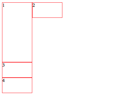
<!DOCTYPE html>
<html><head><meta charset="UTF-8"><title></title><style type="text/css">#div1,#div2,#div4 {border: 1px solid red;float: left;width: 100px;height: 50px;}#div1 {height: 200px;}#div3 {border: 1px solid red;width: 100px;height: 50px;clear: both;}</style></head><body><div id="div1">1</div><div id="div2">2</div><div id="div3">3</div><div id="div4">4</div></body>
</html>
PS:由此说明清除元素,不会出现卡住的情况。
注意事项:
1、如果一行不够排下所有的div,则会自动换行。
2、在元素超过一行,如果有某个div过大,则会卡住别的div。
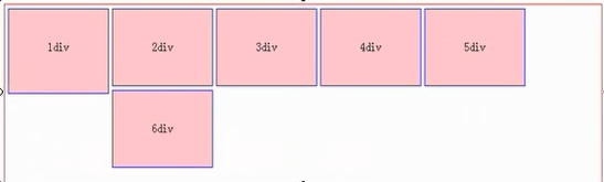
3、如果过大的那个div是一行中的倒数第二个div,那么被卡住的那个div会在第一个div下面。因为如果放在卡住的那个div后面,明显空间不够。
标准流:在网页布局中,写在前面的元素出现在前面,写在后面的元素,显示在后面,这是默认的布局方式,也称标准流。
非标准流:在实际网页布局中,可能需要使用非标准流的方式来布局(让某个元素脱离它本身的位置)。
之前写的的所有HTML都是使用static定位的。static是默认的方式,对static而言,left和right是不生效的。
元素框偏离某个位置(left 和 top),元素仍然保持为定位前的形状,它原本所占的空间仍保留,从这一角度看,好像该元素仍然在文档流/标准流中一样。
特别说明:relative的参照点是它原来的位置,进行移动。
实例:
<!DOCTYPE html>
<html><head><title>HTML12.html</title><meta http-equiv="keywords" content="keyword1,keyword2,keyword3"><meta http-equiv="description" content="this is my page"><meta http-equiv="content-type" content="text/html; charset=UTF-8"><link rel="stylesheet" type="text/css" href="../resource/css/HTML12.css" /></head><body><div class="div1">内容1</div><div class="div1" id="special">内容2</div><div class="div1">内容3</div><div class="div1">内容4</div></body>
</html>
@CHARSET "UTF-8";
body {margin: 0px auto;padding: 0px;width: 1000px;height: 800px;border: 1px solid red;
}.div1 {width: 100px;height: 60px;background-color: gray;float: left;margin-left: 10px;margin-top: 10px;
}/* relative是相对定位:相对于父元素的坐标系进行定位 */
#special {position: relative;/* 相对定位 */left: 40px; /* 在原来的位置,向右移动大小 */top: 100px; /* 在原来的位置,向下移动大小 */
}相当于元素从原来的位置脱离,并让出自己的空间,后面的元素就会占有让出的空间。
特别说明:absolute定位是相对于离自己最近的那个非标准流盒子而言的。
实例:
<!DOCTYPE html>
<html><head><title>HTML13.html</title><meta http-equiv="keywords" content="keyword1,keyword2,keyword3"><meta http-equiv="description" content="this is my page"><meta http-equiv="content-type" content="text/html; charset=UTF-8"><link rel="stylesheet" type="text/css" href="../resource/css/HTML13.css" /></head><body><div class="div2"><div class="div1">内容1</div><div class="div1" id="special">内容2</div><div class="div1">内容3</div><div class="div1">内容4</div></div></body>
</html>
@CHARSET "UTF-8";
body {margin: 0px auto;padding: 0px;width: 1000px;height: 800px;border: 1px solid red;
}.div1 {width: 100px;height: 60px;background-color: gray;float: left;margin-left: 10px;margin-top: 10px;
}#special {position: absolute;/* 绝对定位 */left: 600px; /* 在原来的位置,向右移动大小 */top: 100px; /* 在原来的位置,向下移动大小 */
}
/* absolute定位是以最近的已定位(非标准流)祖先来定位的,当祖先用relative,absolute,fixed定位时,
子元素用absolute定位就是相对于祖先元素的坐标系定位,而没有已定位(非标准流)祖先元素时,则相对于body进行定位 */
.div2 {margin: 1px auto;border: 1px solid blue;width: 800px;height: 700px;position: relative;left: 50px;top: 50px;
}
元素框的表现类似于将position设置为absolute,不过其包含块是视窗本身,也就是body元素。
实例:
<!DOCTYPE html>
<html><head><title>HTML14.html</title><meta http-equiv="keywords" content="keyword1,keyword2,keyword3"><meta http-equiv="description" content="this is my page"><meta http-equiv="content-type" content="text/html; charset=UTF-8"><link rel="stylesheet" type="text/css" href="../resource/css/HTML14.css" /></head><body><div class="div2"><div class="div1">内容1</div><div class="div1" id="special">内容2</div><div class="div1">内容3</div><div class="div1">内容4</div></div></body>
</html>
@CHARSET "UTF-8";
body {margin: 0px auto;padding: 0px;width: 1000px;height: 800px;border: 1px solid red;
}.div1 {width: 100px;height: 60px;background-color: gray;float: left;margin-left: 10px;margin-top: 10px;
}/* fixed则是相对于body进行定位 */
#special {position: fixed; /* 固定定位 */left: 700px; /* 在原来的位置,向右移动大小 */top: 150px; /* 在原来的位置,向下移动大小 */
}.div2 {margin: 1px auto;border: 1px solid blue;width: 800px;height: 700px;position: relative;left: 50px;top: 50px;
}
<!DOCTYPE html>
<html><head><title>HTML15.html</title><meta http-equiv="keywords" content="keyword1,keyword2,keyword3"><meta http-equiv="description" content="this is my page"><meta http-equiv="content-type" content="text/html; charset=UTF-8"><link rel="stylesheet" type="text/css" href="../resource/css/HTML15.css" /></head><body><!-- 首部  --><div class="head"><div class="login">登录表单</div><div class="setpage">设为首页</div><div class="seta">设置超链接</div></div><!-- 导航部分 --><div class="nav"><img alt="logo" src="../resource/images/logo.png" /><div>导航条</div></div><!-- 广告部分--><div class="ad"><div class="ad1">招生</div><div class="ad2">广告</div><div class="ad3">房地产广告</div><div class="ad4"><img alt="ad" src="../resource/images/ad2.png" /></div></div></body>
</html>
@CHARSET "UTF-8";body {margin: 0px auto;padding: 0px;width: 1000px;border: 1px solid red;
}/* 首部 */
.head{margin: 0px;padding: 0px;border: 1px solid blue;width: 1000px;height: 25px;margin-bottom: 5px;
}.login {width: 500px;margin-right: 5px;margin-left: 5px;
}.setpage {width: 200px;margin-right: 5px;
}.seta {width: 280px;
}.login,.setpage,.seta {float: left;height: 25px;background-color: silver;
}/* 导航条部分 */
.nav {border: 1px solid red;width: 1000px;height: 67px;margin-bottom: 10px;
}.nav img {width: 140px;margin-right: 5px;
}.nav div {background-color: aqua;width: 855px;
}.nav img,.nav div {float: left;height: 67px;
}/* 广告部分 */
.ad {margin-bottom: 10px;border: 1px solid red;width: 1000px;height: 186px;
}.ad1 {background-color: orange;width: 140px;
}.ad2 {background-color: aqua;width: 500px;
}.ad3 {background-color: aqua;width: 175px;}.ad4 {
}.ad1,.ad2,.ad3,.ad4 {float: left;height: 186px;margin-right: 5px;
}
----------参考《韩顺平.轻松搞定网页设计(html+css+js)》
版权声明:本站所有资料均为网友推荐收集整理而来,仅供学习和研究交流使用。
工作时间:8:00-18:00
客服电话
电子邮件
admin@qq.com
扫码二维码
获取最新动态